To create YouTube thumbnails that get more clicks, choose one clear visual idea, use a recognizable subject, keep text brief, and make the design readable at small sizes. Match the thumbnail to the video title and deliver what the image promises.
Learning how to create YouTube thumbnails that get more clicks starts with one clear idea: show viewers why the video is worth their time. A strong thumbnail combines a recognizable subject, a focused message, and a design that remains clear on small screens. It should attract attention without misleading people about the content.
This guide explains YouTube thumbnail design from planning and image selection to editing, exporting, and performance testing. You will also find practical examples for technology videos, free and paid design tools, AI-assisted workflows, and a separate strategy for YouTube Shorts.
1. Why Are YouTube Thumbnails So Important?
A YouTube thumbnail is often the first visual element viewers notice when browsing videos. Before deciding whether to watch, people quickly scan titles and images to find content that interests them. A well-designed thumbnail helps communicate the video’s subject and gives viewers a reason to explore further. It can also help your content stand out among competing videos.
First Impressions: How Thumbnails Capture Viewer Attention
YouTube viewers encounter hundreds of videos through search results, recommendations, and their subscriptions. They rarely examine every video in detail. Instead, they scan the available options and notice visuals that catch their attention.
A clear image, strong contrast, and recognizable subject help viewers understand a video’s topic quickly. The thumbnail should communicate the subject before viewers need to read the full title.
However, attracting attention is only the first step. The thumbnail must communicate the video’s actual subject and set the right expectations.
How Thumbnails Influence Viewers’ Clicking Decisions
When viewers browse YouTube, they make quick decisions about which videos deserve their attention. A relevant and visually appealing thumbnail can help them understand what a video offers.
For example, someone searching for a Windows troubleshooting tutorial may notice a thumbnail showing a laptop, a recognizable error message, and a short text overlay. These visual elements immediately communicate the topic.
An effective thumbnail should answer one important question: Why should someone watch this video?
It should create curiosity without confusing viewers or making promises the video cannot deliver.
The Relationship Between Thumbnails, Video Titles, and Click-Through Rate (CTR)
Thumbnails and titles work together to attract viewers. The thumbnail communicates the idea visually, while the title provides additional context.
Consider a video titled “How to Fix Wi-Fi Connected but No Internet in Windows 11.”
Thumbnail: A laptop displaying a Wi-Fi connection symbol with the text “NO INTERNET?”
Title: Explains exactly what the tutorial helps viewers fix.
The thumbnail catches attention, while the title clarifies the video’s purpose.
YouTube measures how often viewers click after seeing a video impression through a metric called click-through rate (CTR). A relevant thumbnail and title combination can encourage more clicks. However, CTR varies by traffic source, audience, and video topic. A higher CTR alone does not guarantee better video performance.
How Thumbnails Contribute to Video Discovery
YouTube uses several systems to help viewers discover videos, including Search, Browse features, and Suggested Videos. Thumbnails help present videos across these different surfaces.
A well-designed thumbnail can make a video easier to recognize and understand when it appears alongside competing content. This is particularly useful for technology tutorials, product reviews, and software demonstrations.
However, thumbnails are not direct ranking guarantees. YouTube also considers viewer behavior, satisfaction, relevance, and other signals when recommending videos.
Why Attractive Thumbnails Must Accurately Represent the Video
An attractive thumbnail may generate curiosity, but misleading visuals can disappoint viewers. If the actual video does not deliver what the thumbnail promises, people may leave quickly or lose trust in the creator.
For example, avoid showing a premium software feature when your tutorial only explains its free alternative. Similarly, don’t display a dramatic Windows error message if the video covers an unrelated problem.
Your thumbnail should make the video appealing while remaining honest about its content.
Remember: The best YouTube thumbnail does more than attract clicks. It attracts the right viewers by accurately communicating what they can expect from your video.
2. YouTube Thumbnail Requirements and Technical Specifications
Before designing a YouTube thumbnail, understand the platform’s technical requirements. A well-designed image may look sharp on your computer but appear cropped, blurry, or distorted after uploading if you use the wrong dimensions or aspect ratio. Following YouTube’s recommended specifications helps your thumbnails display correctly across different devices and viewing surfaces.
Recommended YouTube Thumbnail Dimensions and Resolution
YouTube recommends creating custom thumbnails at 3840 × 2160 pixels for regular videos. This provides a high-resolution image that remains clear across different display sizes. Check the current official thumbnail requirements before exporting.
The minimum recommended width for regular video thumbnails is 640 pixels. However, using the recommended resolution gives you more flexibility when editing and exporting your designs.
For standard YouTube videos, use these dimensions:
Recommended resolution: 3840 × 2160 pixels
Minimum width: 640 pixels
Aspect ratio: 16:9
Orientation: Landscape
Although 1280 × 720pixels has been widely used as the standard thumbnail size, YouTube’s current Help documentation recommends 3840 × 2160 pixels. You should follow the latest official specifications when creating new designs.
Aspect Ratio, Image Formats, and File Size Limits
The aspect ratio determines the relationship between an image’s width and height. YouTube recommends a 16:9 aspect ratio for regular video thumbnails because it fits the platform’s standard video player and preview layouts.
You can use JPG or PNG for your thumbnail images. JPG is generally suitable for photographs and compressed images, while PNG is useful for graphics, text, and designs with sharp edges.
The maximum file size depends on the upload method. YouTube currently allows regular video thumbnails up to 50 MB on desktop and 2 MB on mobile. Desktop uploads for both regular videos and Shorts can be up to 50 MB. YouTube’s current Help page does not list a separate mobile upload workflow for custom Shorts thumbnails; those uploads are made through YouTube Studio on a computer.
Specification
Desktop upload
Mobile upload
Maximum file size
50 MB
2 MB
Recommended format
JPG or PNG
JPG or PNG
Aspect ratio
16:9
16:9
For the best results, export your thumbnail in the recommended dimensions and check its file size before uploading. Compress the image if necessary without noticeably reducing its quality.
Custom Thumbnails vs. Automatically Generated Thumbnails
YouTube provides two main ways to select a video’s thumbnail: automatically generated suggestions and custom thumbnails uploaded by creators.
Automatically generated thumbnails: YouTube selects preview images from frames in your uploaded video. You can choose from the available suggestions when publishing or editing eligible videos. This option is convenient, but the selected frame may not communicate your video’s main idea effectively.
Custom thumbnails: You create an image using a design tool and upload it through YouTube Studio. This gives you greater control over the visual presentation, including text, colors, backgrounds, and image placement.
For example, a video explaining how to fix a Windows 11 error might have a suitable frame showing the computer screen. However, a custom design could communicate the problem more clearly with an error symbol, a laptop image, and a short text overlay.
Custom designs are particularly useful for technology tutorials, product reviews, comparisons, and educational videos.
YouTube Thumbnail Requirements for Shorts
YouTube Shorts use a vertical viewing format, so their thumbnail requirements differ from regular videos.
YouTube recommends the following specifications for custom Shorts thumbnail images:
Recommended resolution: 2160 × 3840 pixels
Aspect ratio: 9:16
Minimum height: 640 pixels
Image formats: JPG or PNG
You can select a frame from a Short in the YouTube mobile app. For a separate custom image, YouTube currently supports uploading a Shorts thumbnail through YouTube Studio on a computer. Your account must be verified.
YouTube’s current Help documentation specifies computer-based uploads through YouTube Studio for custom Shorts thumbnails and requires a verified account. It does not identify YouTube Partner Program membership as a requirement. If the upload option is unavailable, check your channel verification and feature eligibility.
Practical tip: Don’t simply reuse a regular video’s landscape thumbnail for Shorts. Design vertical visuals that remain clear and recognizable in the Shorts feed and on your channel page.
Cropping note: YouTube says vertical videos with 16:9 custom thumbnails may display an automatically generated 4:5 thumbnail on Home, Explore, and subscription pages. The custom image can still appear in the watch feed, watch history, and non-mobile platforms. Keep the main subject and essential text away from the edges, and preview the design in the places where viewers may see it.
Custom Thumbnail Eligibility and YouTube Policies
Not every YouTube account automatically has access to custom thumbnail uploads. YouTube requires account verification for this feature. If you cannot find the custom thumbnail option in YouTube Studio, check your channel’s feature eligibility and verification status.
You must also follow YouTube’s Community Guidelines when creating thumbnails. Avoid content that contains:
Nudity or sexually provocative imagery.
Hate speech or hateful symbols.
Graphic violence.
Harmful or dangerous content.
Misleading images that falsely represent the video.
Violating these policies can result in thumbnail removal, restrictions on custom thumbnail privileges, or other account penalties.
YouTube also limits the number of custom thumbnails a channel can upload within a day. These limits may vary depending on the channel’s history and other factors.
Remember: A technically correct thumbnail is only the starting point. It must also be visually clear, relevant to your video, and appealing to your intended audience.
A successful YouTube thumbnail is not simply an attractive image. It is a carefully arranged visual that communicates an idea quickly and makes viewers interested in the video. Good design helps viewers understand the subject without requiring them to read lengthy text or examine every detail.
You do not need advanced graphic design skills to create effective thumbnails. However, understanding a few essential design principles can help you produce clearer, more appealing visuals. Let’s explore the elements that make a thumbnail effective.
Visual Hierarchy and Focal Points
Visual hierarchy determines which elements viewers notice first, second, and third. It guides their eyes through the thumbnail and helps them understand its main message.
Every thumbnail should have one dominant visual element. This could be a person’s face, a smartphone, a laptop, a software interface, or another object related to the video. Supporting elements should reinforce the main subject rather than compete with it.
For example, if you’re creating a thumbnail for a Windows troubleshooting tutorial, you could use a laptop displaying an error message as the main visual. A warning symbol and a short text overlay can provide additional context.
Consider these practical guidelines:
Make the main subject larger and more prominent.
Use secondary elements only when they support the message.
Place important text where viewers can notice it easily.
Avoid giving equal visual importance to every element.
Practical tip: Squint at your thumbnail or view it as a small image. If you cannot identify its main subject immediately, simplify the design.
Contrast and Complementary Color Combinations
Contrast makes important elements stand out from their surroundings. It helps separate the subject from the background and improves readability.
You can create contrast through differences in color, brightness, size, and visual weight. For example, bright text against a dark background is often easier to read than two similar shades placed together.
Complementary colors can also create visual interest. These are colors positioned opposite each other on the color wheel, such as blue and orange or red and green.
However, you don’t need to use bright colors everywhere. Too many competing colors can make a thumbnail look confusing.
Check Color Contrast and Accessibility
A thumbnail should remain understandable to viewers with different visual needs. Do not rely on color alone to communicate an error, warning, or comparison. Pair color with a recognizable icon, label, shape, or clear difference in the objects.
Check that text stands out from its background. If the letters disappear when you reduce the image, increase the contrast, add a simple outline, or place the text on a subtle solid panel. Avoid placing thin text over a busy photograph.
Be cautious with red-and-green combinations when they carry the only meaning. Some viewers may not distinguish those colors easily. Add labels such as ‘ON’ and ‘OFF’, use different shapes, or show the compared objects directly.
A quick practical test is to view the thumbnail in grayscale and at a small size. If the main subject and message become difficult to distinguish, strengthen the visual separation.
For a technology tutorial, a dark blue background with white text and a small orange accent can create a clean, professional appearance.
Typography and Text Readability
Text helps viewers understand the video’s subject and reinforces the message conveyed by the image. However, thumbnail text should be short, clear, and easy to read.
Avoid copying the entire video title onto the thumbnail. Instead, select a few meaningful words that communicate the main benefit or create curiosity.
For example:
Video title
Thumbnail text
How to Fix Wi-Fi Connected but No Internet
NO INTERNET?
Best AI Writing Tools for Content Creators
WRITE FASTER
Windows 11 Features You Should Know
HIDDEN FEATURES
Best Budget Smartphones in 2026
TOP PICKS
Choose bold, easily readable fonts. Sans-serif fonts are generally useful because their letter shapes remain clear at smaller sizes.
Additional typography tips:
Use one or two font families.
Avoid thin or decorative fonts.
Maintain sufficient contrast between text and background.
Keep important words large enough to read on mobile screens.
Avoid unnecessary punctuation and long sentences.
Remember: Thumbnail text should support the image, not overwhelm it.
Composition, Alignment, and Spacing
Composition refers to how visual elements are arranged within the thumbnail. A well-composed design helps viewers understand the subject without feeling overwhelmed.
One useful technique is the rule of thirds. Imagine dividing your thumbnail into nine equal sections using two horizontal and two vertical lines. Placing the main subject near one of the intersection points can create a balanced composition.
For example, you could place a laptop on the left side and use the right side for a short headline. This creates a clear separation between the subject and supporting text.
Other useful composition guidelines include:
Align text and visual elements consistently.
Leave sufficient space around important objects.
Avoid placing too many elements close together.
Maintain a clear relationship between the subject and background.
Use directional elements to guide the viewer’s eyes.
Good composition makes a thumbnail easier to understand, even when displayed at a small size.
Safe Areas, Cropping, and Small-Screen Previews
YouTube can display thumbnail images in different sizes and layouts. A design that looks balanced on a full desktop canvas may lose important details when shown as a small preview or cropped placement. Keep the main subject and essential words inside a central safe area rather than placing them against the edges.
Before exporting, preview the image at a small size. Check that the subject remains recognizable, every word is readable, and no important detail sits close to the top, bottom, or sides. For Shorts, also check the vertical image against narrower preview crops. Treat the safe area as a practical design guide, not a guarantee that every YouTube surface will show the same crop.
Balance, Simplicity, and Negative Space
A thumbnail should communicate one main idea rather than several unrelated messages. Adding too many images, icons, labels, and decorative elements can make the design difficult to understand.
Negative space refers to the empty areas surrounding important visual elements. It gives the subject room to stand out and prevents the design from looking crowded.
For example, a smartphone review thumbnail might need only a product image, a short headline, and a simple background. Adding several unrelated icons, multiple text blocks, and decorative shapes may weaken the overall design.
Keep these principles in mind:
Focus on one main message.
Remove unnecessary visual elements.
Leave enough breathing room around text and images.
Avoid filling every available space.
Use empty space to emphasize important elements.
A simple thumbnail is not necessarily a boring thumbnail. A focused design can communicate more effectively than a complicated one.
Color Psychology and Emotional Appeal
Colors can influence how viewers perceive a thumbnail. Different combinations can create different moods and associations.
For example, blue is commonly associated with trust and technology, while red can communicate urgency or excitement. Yellow can help important elements stand out, and green is often associated with growth or positive outcomes.
However, color meanings are not universal. Their effect depends on context, culture, surrounding colors, and the subject of the video.
Consider these common associations:
Color
Common association
Possible use
Blue
Trust, stability, technology
Software tutorials
Red
Urgency, excitement
Troubleshooting videos
Yellow
Energy, attention
Important highlights
Green
Progress, success
Solution-based videos
Orange
Enthusiasm, creativity
Product reviews
Black
Sophistication, contrast
Premium gadgets
Use colors that support your video’s message rather than choosing them simply because they are popular.
For technology creators, blue, black, white, and orange can work well together. However, the best combination depends on the product, background, and intended audience.
Consistent Visual Identity and Channel Branding
Consistent thumbnail design helps viewers recognize your videos when they appear in search results or recommendations. It also gives your channel a more professional and organized appearance.
You don’t need to make every thumbnail identical. Instead, maintain a recognizable visual style across your videos.
For example, you could consistently use:
The same two or three brand colors.
Similar font styles and text placement.
A recognizable logo or small brand mark.
Consistent image treatment and background styles.
Similar layouts for videos belonging to the same series.
For a technology channel, you might use blue and black backgrounds for software tutorials, while maintaining the same typography and branding across gadget reviews and AI tool demonstrations.
Avoid making every thumbnail look like a copy of the previous one. Consistency should establish recognition without sacrificing relevance to each video’s topic.
Practical takeaway: Build a recognizable thumbnail style, but allow each design to communicate its own video’s message. A strong visual identity helps establish familiarity while keeping your content fresh.
4. How to Plan a YouTube Thumbnail Before Designing
Creating an effective YouTube thumbnail starts before opening a design tool. You need a clear idea of what the video offers and how to communicate that message visually. Planning helps you avoid unnecessary design changes and keeps the final image focused on the right audience.
A good thumbnail should attract attention, create curiosity, and accurately represent the video. The following steps will help you develop a strong concept before beginning the actual design.
Understand Your Target Audience and Their Expectations
Before designing a thumbnail, consider who will watch your video. Different audiences respond to different visual styles, messages, and presentation techniques.
For example, viewers searching for technology tutorials usually want clear information about a specific problem or solution. A thumbnail showing a laptop, an error message, and a short headline may appeal to them. On the other hand, viewers interested in smartphone reviews may respond better to a prominent product image and a comparison message.
Consider these questions:
Who is most likely to watch this video?
What problem are they trying to solve?
What information or benefit are they expecting?
Which visual elements would help them recognize the topic?
What type of thumbnail would appeal to this audience?
Understanding your audience helps you choose relevant images, colors, and text instead of relying on random design trends.
Identify the Main Message and Value of Your Video
Every thumbnail should communicate one primary idea. Before designing it, identify the most important information or benefit viewers will get from watching your video.
For example, suppose your video explains how to improve laptop battery life in Windows 11. You could highlight the battery problem, show a laptop, and use a short phrase such as “SAVE BATTERY LIFE.”
Avoid trying to communicate every point covered in the video. A thumbnail is a visual introduction, not a summary of the entire content.
To identify the main message:
Write down the central topic of your video.
Identify the main problem, benefit, or question.
Select one visual that represents that idea.
Choose a short supporting phrase if necessary.
Remove details that do not strengthen the message.
Practical tip: If you cannot explain your thumbnail’s main message in one sentence, simplify the concept before designing it.
Align the Thumbnail Concept With the Video Title
Your thumbnail and title should complement each other. They should communicate the same overall idea without repeating exactly the same words.
The title provides context, while the thumbnail communicates the message visually. When both elements work together, viewers can understand the video’s purpose more quickly.
Consider this example:
Element
Example
Video title
How to Fix Wi-Fi Connected but No Internet in Windows 11
Thumbnail text
CONNECTED, NO INTERNET?
Main visual
Laptop with a Wi-Fi symbol and warning indicator
The title explains the problem in detail, while the thumbnail highlights the issue visually.
Avoid creating a thumbnail that promises something different from the video title. This can confuse viewers and create false expectations.
Research Competing Thumbnails Without Copying Them
Studying thumbnails from successful channels can help you understand how creators present similar topics. Search YouTube for videos covering the same subject and examine their visual approaches.
Pay attention to:
How creators arrange the main subject.
Whether they use faces, products, screenshots, or illustrations.
How much text appears in the design.
Which colors and backgrounds they use.
How clearly the thumbnail communicates the topic.
For example, when researching Windows troubleshooting thumbnails, you may notice that creators frequently use computer screenshots, warning symbols, and short problem-focused text.
Use these observations to identify common patterns and opportunities to present your own content differently.
Don’t copy another creator’s complete design, images, branding, or distinctive visual identity. Your goal is to understand what communicates effectively and develop an original concept.
Turn this research into a repeatable five-step process:
Search YouTube using the exact topic or problem your video will address.
Review videos aimed at a similar audience, not just channels with the largest subscriber counts.
Note the visual patterns: subject placement, use of faces, screenshots, product images, text length, colors, and the promise made by the title.
Identify what is missing or unclear. Could your thumbnail show the actual error, a more recognizable product, a clearer result, or a different angle?
Save useful examples in a private reference collection or swipe file. Record what communicates well, but create your own composition and use assets you have permission to publish.
You can also use YouTube Analytics’ Audience tab and research insights to learn what your viewers watch and search for. This gives you audience-specific context beyond a general search of competing videos.
Do not assume a popular thumbnail caused a video’s success. The channel’s reputation, topic, timing, title, and existing audience can all influence performance.
Sketch and Plan the Thumbnail Layout
Once you have identified your audience, message, and visual direction, plan where each element will appear.
You don’t need professional drawing skills. A simple rough sketch is enough to establish the composition before using Canva, Photoshop, or another design tool.
For example, a thumbnail for a software tutorial could follow this arrangement:
Left side: Main subject, such as a laptop or software screenshot.
Right side: Short headline that communicates the topic.
Background: A simple contrasting color.
Supporting element: A small warning symbol or relevant icon.
You can also use a simple layout sketch to experiment with different placements before committing to the final design.
Check that the main subject and text remain visible when the image is reduced to a smaller size.
Develop Multiple Thumbnail Concepts
Don’t settle for the first design idea. Creating a few alternatives helps you explore different ways to communicate the same video topic.
For example, a smartphone review could have three possible concepts:
Product-focused: A large smartphone image with a short headline.
Feature-focused: A close-up of the camera with the text “CAMERA TEST.”
Comparison-focused: Two smartphones displayed side by side.
Each concept communicates a different aspect of the same video. You can choose the one that best represents its main value.
YouTube’s A/B testing feature lets eligible creators compare up to three thumbnail variations, or combinations of titles and thumbnails, on supported long-form videos. YouTube selects the option with the highest watch-time share, not simply the highest click-through rate. Shorts, scheduled live streams, and Premiere videos are not currently eligible.
Practical takeaway: Plan your thumbnail around the audience, the video’s main message, and the title. Research competing designs, sketch your layout, and explore alternative concepts before creating the final image. Good planning makes the design process easier and helps prevent misleading or cluttered thumbnails.
5. How to Create a YouTube Thumbnail Step by Step
Once you have planned your thumbnail concept, it’s time to turn it into a finished design. You don’t need expensive software or advanced graphic design experience to get started. Tools such as Canva, Adobe Express, Photoshop, and Photopea provide features that help beginners and experienced creators design professional-looking thumbnails.
The following steps explain how to create a YouTube thumbnail, from choosing the canvas size to exporting the final image.
Step 1: Choose the Correct Canvas Size and Aspect Ratio
Start by creating a new design with the correct dimensions. For regular YouTube videos, use the recommended 16:9 aspect ratio and a resolution of 3840 × 2160 pixels.
This landscape format fits YouTube’s standard video presentation and helps maintain image quality across different screens.
Before starting, check these settings:
Canvas width: 3840 pixels.
Canvas height: 2160 pixels.
Aspect ratio: 16:9.
Orientation: Landscape.
Background: Choose a suitable color or image.
Most thumbnail design tools provide ready-made YouTube thumbnail templates. You can select one instead of entering the dimensions manually.
If you are designing a thumbnail for YouTube Shorts, use a separate vertical layout. Don’t stretch a landscape thumbnail into a vertical format because this can crop important elements and affect readability.
Step 2: Select a Suitable Image or Visual Asset
The main image is one of the most important elements of your thumbnail. It should immediately communicate the video’s subject and help viewers understand what to expect.
Choose an image that directly relates to your video rather than using an attractive but unrelated stock photograph.
For example:
Windows tutorial: A laptop screen showing the relevant Windows feature or error.
Smartphone review: A clear product photograph showing the phone.
AI tool review: A relevant software interface or illustrative AI visual.
Faceless tech video: A computer, software screenshot, or technology-related illustration.
You can obtain suitable visuals from your own photographs, screenshots, original illustrations, licensed stock-image libraries, or AI image-generation tools.
When selecting an image, consider its resolution, lighting, clarity, and background. Avoid blurry images or visuals containing too many unnecessary details.
Practical tip: Use your own product photographs and screenshots whenever possible. Original visuals make technology thumbnails more relevant and help establish your channel’s identity.
Choose Visual Assets That Are Accurate and Properly Licensed
Use genuine product photographs when the video reviews or compares a physical device. Use your own software screenshots when the tutorial demonstrates a real interface or setting. Illustrations work well when you need to explain an abstract idea, while a licensed stock image can support a broader concept when it is relevant to the video.
AI-generated backgrounds can add atmosphere, but they should not invent product details, software screens, logos, or features. For a technology review, show the actual device or interface wherever accuracy matters. Before using stock images, fonts, templates, or AI-generated assets commercially, read the provider’s current licence and usage terms. Keep records of the source and licence for assets used in published designs. For more AI-assisted creator workflows, see: Best AI Tools for YouTubers
Step 3: Remove Backgrounds and Isolate Important Subjects
Sometimes the original photograph contains a distracting background. Removing it can help you separate the main subject and place it against a more suitable design.
For example, you may photograph a smartphone against a plain background and remove that background before placing the device over a colored thumbnail design.
Many tools offer background-removal features:
Canva’s background remover.
Adobe Express background removal.
Adobe Photoshop’s subject selection and masking tools.
Online background-removal services.
Some of these features require paid subscriptions.
After removing the background, check the subject’s edges carefully. Look for unwanted outlines, missing details, or rough edges around the object.
You can then position the isolated subject over a contrasting background.
Remember that background removal is not necessary for every thumbnail. A well-composed original photograph or software screenshot may work better without additional editing.
Step 4: Arrange the Main Subject and Supporting Elements
Now arrange the visual elements according to the layout you planned earlier.
Place the main subject where viewers can recognize it immediately. Add supporting elements only when they help explain the video’s topic.
For example, a thumbnail about fixing a Windows error could include:
A laptop showing the relevant error.
A recognizable warning symbol.
A short headline highlighting the problem.
A simple background that separates these elements.
Keep the composition balanced. Don’t place every element in the center or crowd the image with unnecessary icons and decorative shapes.
Leave enough space around the main subject and text. Also, check that important elements are not positioned too close to the edges.
Step 5: Add Short, Compelling Thumbnail Text
Text can help communicate your video’s main idea, especially when the subject is not immediately obvious from the image.
However, thumbnail text should be brief. Avoid repeating the complete video title or adding long sentences.
For example:
Video topic
Suggested thumbnail text
Fix Windows 11 Wi-Fi problems
NO INTERNET?
Best AI writing tools
WRITE FASTER
Smartphone camera review
CAMERA TEST
Windows 11 hidden features
HIDDEN FEATURES
Laptop battery problems
SAVE BATTERY LIFE
Choose bold fonts that remain readable when the thumbnail appears in a small preview.
You can also emphasize one important word using a contrasting color, larger font size, or different text weight.
Avoid using too many fonts or placing text over complicated backgrounds.
Practical tip: After adding the text, reduce the thumbnail’s preview size. If you struggle to read it, simplify the wording or increase its size.
Step 6: Adjust Colors, Brightness, Contrast, and Sharpness
Once the main elements are in place, improve the overall appearance through basic image adjustments.
Brightness controls how light or dark an image appears. Contrast determines the difference between lighter and darker areas. Sharpness helps define edges and details.
These adjustments can make the subject more noticeable and improve the visual clarity of your thumbnail.
Consider making these changes:
Increase contrast when the subject blends into the background.
Adjust brightness to reveal important details.
Use saturation carefully to make colors more noticeable.
Improve sharpness without creating unnatural edges.
Correct color balance when the image looks too warm or too cool.
Avoid excessive editing. Oversaturated colors, artificial-looking skin, and extreme sharpening can make a thumbnail appear unprofessional.
Your goal is to make the important elements clear, not to apply every available effect.
Step 7: Add Branding and Finishing Touches
Consistent branding helps viewers recognize your videos across YouTube. You can maintain a recognizable style through colors, typography, layouts, and other visual elements.
For example, a technology channel might use blue and black backgrounds, bold white headlines, and a small logo in a consistent position.
Before completing the design, check:
Whether the main subject is clearly visible.
Whether the text is readable.
Whether the colors work together.
Whether the thumbnail matches your channel’s visual identity.
Whether any decorative elements distract from the main message.
Don’t make your logo or branding larger than the main subject. The video’s topic should remain the primary focus.
Step 8: Preview and Export the Finished Thumbnail
Before exporting, inspect your design at its original size and as a small thumbnail. A design that looks impressive on a large computer screen may become difficult to understand when reduced.
Check the following:
Is the main subject immediately recognizable?
Can viewers read the text easily?
Does the design communicate the video’s topic?
Is the image visually balanced?
Are there any spelling mistakes?
Does the thumbnail meet YouTube’s technical requirements?
Once everything looks correct, export the image in JPG or PNG format.
For regular YouTube videos, use the recommended 3840 × 2160-pixel resolution and 16:9 aspect ratio. Check the file size before uploading, as the maximum upload size can depend on the device.
Save an editable version of your design as well. This allows you to make changes later without recreating the entire thumbnail.
Practical Walkthrough: Design a Windows 11 Wi-Fi Troubleshooting Thumbnail
Imagine that your video is titled “How to Fix Wi-Fi Connected but No Internet in Windows 11.” The thumbnail should communicate the problem at a glance without repeating the full title. Use this project to apply the eight steps above.
Set the canvas: Create a 3840 × 2160-pixel landscape design with a 16:9 aspect ratio.
Choose the main visual: Use an original laptop image or a genuine screenshot that represents the connection problem. Do not fabricate a Windows error screen.
Simplify the background: Use a dark blue background and remove distractions around the laptop.
Arrange the elements: Place the laptop on the right and leave clear space on the left for the headline.
Add the headline: Use “NO INTERNET?” in large, bold lettering. Keep the question mark only if it suits the design.
Add one supporting cue: Include a simple Wi-Fi warning symbol. Avoid adding several unrelated icons.
Check contrast and cropping: Make the headline easy to read and keep the laptop and text away from the canvas edges.
Preview and export: Reduce the design to a small preview, check spelling and clarity, then export as JPG or PNG within YouTube’s current file-size limit.
Final review: At a glance, viewers should understand that the video solves a Wi-Fi connection problem. The thumbnail does not need to show every troubleshooting step. Its job is to set an accurate expectation; the video must provide the solution.
Practical takeaway: Creating an effective YouTube thumbnail is a process of selecting relevant visuals, arranging them clearly, adding readable text, and refining the final design. Follow these steps consistently, and you’ll develop a repeatable workflow for producing thumbnails for your channel.
6. What Is the AIDA Principle in YouTube Thumbnail Design?
The AIDA principle is a marketing framework that explains how to attract attention and encourage people to take action. AIDA stands for Attention, Interest, Desire, and Action. It describes four stages that can guide a person’s decision-making process.
You can apply this framework when designing YouTube thumbnails. Instead of simply creating an attractive image, you can use visual elements to capture attention, create curiosity, communicate value, and encourage viewers to click.
The first step is to make viewers notice your video. YouTube displays numerous thumbnails across search results, recommendations, and the homepage. Your design needs a clear visual element that stands out among other videos.
You can capture attention through:
A prominent image of a person, product, or device.
Strong contrast between the subject and background.
Large, readable text highlighting the main topic.
Recognizable symbols or visual elements.
An interesting visual arrangement.
For example, a Windows troubleshooting thumbnail could show a laptop with a prominent warning symbol and the text “PC ERROR?” This immediately signals that the video addresses a computer problem.
However, avoid using excessive colors, exaggerated expressions, or unrelated images simply to attract attention. The visual should remain relevant to the video.
Interest – Make Viewers Curious About the Video
After attracting attention, your thumbnail should give viewers a reason to explore further. It should communicate an interesting question, problem, or possibility without revealing every detail.
Curiosity can come from highlighting an unexpected feature, an unresolved problem, or an interesting comparison.
For example, a video about hidden Windows 11 features could use the text “HIDDEN FEATURES” alongside a recognizable Windows interface. This encourages viewers to discover which features they might have missed.
You can create interest by:
Highlighting an unusual feature or problem.
Asking a relevant question.
Showing an interesting comparison.
Using a visual that suggests a useful discovery.
Leaving room for curiosity without making the message confusing.
The objective is to make viewers interested in the actual content, not trick them into clicking.
Desire – Communicate the Value or Benefit of Watching
The third stage focuses on showing viewers why the video is worth their time. Your thumbnail should communicate a useful benefit, an interesting discovery, or a problem the video helps solve.
For example, a video about improving laptop battery life could use the text “SAVE BATTERY LIFE” alongside a laptop and battery symbol.
This communicates a clear benefit to viewers who want their laptops to last longer.
To communicate value effectively:
Highlight the main benefit of the video.
Show the product, feature, or result being discussed.
Use simple words that communicate the outcome.
Focus on the audience’s problem or interest.
Make sure the promise matches the actual video.
For technology creators, useful benefits include fixing errors, discovering hidden features, comparing products, improving performance, and learning new software skills.
Action – Encourage Viewers to Click and Watch
The final stage is action. In thumbnail design, this means encouraging viewers to select your video.
You don’t necessarily need to add phrases such as “Click Here” or “Watch Now.” A clear visual message combined with an appealing title can provide enough motivation.
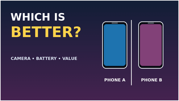
For example, a thumbnail showing two smartphones with the text “WHICH IS BETTER?” creates a reason to explore the comparison.
You can encourage action by:
Making the main message immediately understandable.
Creating a strong connection between the thumbnail and title.
Highlighting a relevant benefit or question.
Avoiding unnecessary visual distractions.
Giving viewers a clear expectation of what they will learn.
Remember that the thumbnail encourages the click, while the video must deliver the promised value.
How to Apply AIDA to Technology Video Thumbnails
Let’s apply the four stages to a practical technology example.
Suppose you’re creating a video titled “Best AI Tools for YouTube Creators.”
You could approach the thumbnail like this:
AIDA stage
Thumbnail design approach
Attention
Show a clear computer screen with a few recognizable creator-tool interfaces.
Interest
Suggest that the video compares several tools for a specific creator task.
Desire
Communicate the practical benefit, such as saving editing or research time.
Action
Use a concise headline such as “WHICH TOOL WORKS BEST?” alongside the video title.
Each stage contributes to the overall visual message. The thumbnail attracts attention, creates interest in the problem, communicates the video’s usefulness, and encourages viewers to explore the solution.
Practical Examples of the AIDA Principle in Thumbnail Design
Here are some additional examples showing how you can apply AIDA to different technology videos.
Example 1: Windows troubleshooting
Attention: Laptop and warning symbol.
Interest: A visible connection problem.
Desire: Find a solution.
Action: “NO INTERNET?”
Example 2: AI tools review
Attention: Recognizable AI-related visuals.
Interest: Several tools presented together.
Desire: Discover useful tools.
Action: “BEST AI TOOLS?”
Example 3: Smartphone comparison
Attention: Two prominent smartphone images.
Interest: A direct product comparison.
Desire: Find the better option.
Action: “WHICH IS BETTER?”
Practical takeaway: AIDA can help you plan a thumbnail’s message. Capture attention, create genuine interest, communicate value, and give viewers a reason to explore the video. It is a marketing framework, not a YouTube ranking formula. Keep the design accurate and let the video deliver on its promise.
7. Professional YouTube Thumbnail Strategies to Improve CTR
Creating an attractive thumbnail is only the starting point. You also need a strategy that encourages the right viewers to click. A good thumbnail communicates the video’s value quickly. It also works with the title to create a clear reason to watch.
Use CTR as one performance signal, not as the only measure of success. The practical strategies below focus on making the thumbnail relevant, distinctive, and easy for the intended audience to understand. Section 14 explains how to interpret CTR and other analytics.
Here are practical strategies to improve your YouTube thumbnail performance.
Create Curiosity Without Misleading Viewers
Curiosity can encourage viewers to click when a thumbnail raises an interesting question or highlights something unexpected. However, it should never promise something the video does not deliver.
For example, a video about useful Windows 11 features could use the phrase “YOU MISSED THESE!” alongside a recognizable Windows interface. This creates curiosity about the features without making an unrealistic promise.
You can create curiosity by:
Highlighting an overlooked feature or useful discovery.
Showing an interesting problem or comparison.
Asking a question that the video answers.
Presenting an unexpected result that appears in the video.
Revealing enough information to establish the topic, but not the entire explanation.
Avoid exaggerated claims such as “SECRET WINDOWS HACK” when the video covers ordinary settings. Misleading thumbnails may attract clicks initially, but they can disappoint viewers and damage trust.
Use Strong Visual Focal Points
Choose the focal point that best represents this video’s specific promise. A product close-up may suit a review, while an actual settings screen may be more useful for a tutorial. Section 3 covers visual hierarchy; here, focus on selecting the subject that makes this particular topic recognizable.
Ask whether the subject would still make sense to someone who has not seen your channel before. If it depends on a familiar face, logo, or recurring visual, add enough context for new viewers.
For a phone review focused on night photography, show the actual camera module or a genuine low-light sample rather than a generic smartphone image.
Choose a subject that illustrates the video’s main point. Avoid decorative objects that add no information.
The strongest focal point is not always the largest object. It is the visual that makes the video’s value easiest to recognize.
Keep Thumbnail Text Short and Memorable
Choose thumbnail wording for its message, not simply because it sounds dramatic. A short phrase can highlight a problem, benefit, comparison, or question that the title explains in full.
Avoid repeating the title word for word. Use the thumbnail text to add a useful detail or emphasize the most compelling part of the topic.
Concept variation
Design direction
Problem-focused
Show a laptop with a nearly empty battery indicator and the message “BATTERY DRAINING?”
Settings-focused
Use a genuine Windows power or battery settings screen with a short label such as “CHANGE THIS SETTING.”
Benefit-focused
Show a relevant battery-saving result covered in the video, with the message “SAVE MORE POWER.”
Presenter-focused
If the creator appears in the video, show them beside the laptop with a natural expression.
Minimalist
Use one recognizable laptop and battery symbol. Add text only if the image needs more context.
Choose wording that remains meaningful without exaggeration. The font and spacing rules are covered in Section 3; the strategic decision is which few words deserve the viewer’s attention.
After choosing the wording, apply the small-preview test from Section 3. Remove any word that does not help explain the topic or its benefit.
Make the Thumbnail Complement the Video Title
Build the title and thumbnail as a pair. The title supplies the full context, while the image highlights one visual hook that makes the topic easy to recognize.
For example, a title can identify the exact software problem, while the thumbnail shows the affected screen or the result viewers want.
Consider this example:
Video title: How to Improve Laptop Battery Life in Windows 11
Thumbnail text: BATTERY DRAINING?
The title explains the Windows 11 task, while the thumbnail highlights the problem that matters to the viewer.
Together, they set an accurate expectation without repeating the same words.
Avoid using a thumbnail that suggests a different topic from the title. Both elements must set the same expectation.
Use Recognizable Objects, Symbols, and Visual Cues
Recognizable objects help viewers understand your topic without reading much text. This is particularly useful for technology channels because many topics have familiar visual symbols.
For example:
A Wi-Fi symbol can represent internet connectivity.
A battery icon can communicate battery-related problems.
A smartphone can indicate a mobile review.
A warning symbol can suggest an error or troubleshooting guide.
An AI-related graphic can introduce an artificial intelligence topic.
A Windows logo or recognizable interface can identify a Windows tutorial.
Choose visual elements that genuinely relate to the video. Avoid adding random technology icons simply to make the thumbnail look more technical.
A few relevant symbols are usually more effective than a crowded collection of images.
Create Contrast Against Surrounding Content
Your thumbnail competes visually with other videos on Search, Home, and Suggested surfaces. It needs a recognizable angle, not simply brighter colors.
Look at the thumbnails covering the same topic. If they all use similar product shots or layouts, consider a different but still accurate way to show your video’s main benefit.
A Windows troubleshooting video might show the exact error screen, while competing thumbnails use generic laptop images. That specific visual can make your design more relevant to the search.
Compare your draft with similar videos at mobile size. Look for a meaningful point of difference, but do not copy another creator’s composition or use unrelated visual tricks.
Design for Mobile-First Viewing
Mobile previews give you a useful test of whether your design communicates quickly. A layout that works on a large monitor may lose its message when reduced.
Review the design at the size viewers are likely to see while browsing.
Make sure the main subject and any essential words remain recognizable. If not, simplify the layout or enlarge the most important element.
Develop Alternative Thumbnail Concepts
Your first design may not always be the strongest option. Creating alternative concepts helps you explore different ways to communicate the same video topic.
For example, a laptop battery tutorial could have three different thumbnail concepts:
A laptop with a nearly empty battery symbol.
A close-up battery graphic with the text “BATTERY DRAINING?”
A laptop displaying a battery-saving setting.
Each concept emphasizes a different visual message. You can compare them and select the one that communicates the topic most clearly.
YouTube now documents this as A/B testing for titles and thumbnails. Eligible creators can compare up to three variations on supported videos. The winning option is selected using watch-time share, not CTR alone. The feature is desktop-only, requires advanced features, and does not currently support Shorts, scheduled live streams, or Premiere videos.
This makes testing useful for understanding which thumbnail contributes to stronger viewing performance. Check YouTube’s current eligibility and testing requirements before using the feature.
Understand Impressions and CTR Before Changing Thumbnails
Before changing a thumbnail, examine its performance in YouTube Studio. Two important metrics can help you understand how viewers respond to your video: impressions and click-through rate (CTR).
Impressions indicate how many times YouTube registered your thumbnail as shown to viewers. YouTube counts an impression when at least 50% of the thumbnail is visible for more than one second on eligible YouTube surfaces. You can review the platform’s definition of thumbnail impressions in YouTube Help.
Click-through rate (CTR) measures how often viewers watched your video after seeing a registered thumbnail impression. For example, if your video receives 1,000 impressions and 50 views from those impressions, its CTR is 5%.
You can find these metrics in YouTube Studio:
Open YouTube Studio.
Select Content from the left-hand menu.
Choose the video you want to examine.
Open Analytics.
Select the Reach tab or the relevant Content analytics report.
Review impressions, CTR, traffic sources, and watch time.
YouTube provides an impressions report showing how thumbnail impressions lead to views and watch time. For the wider video optimization process, read our guide: YouTube SEO for Beginners
Don’t judge CTR in isolation. A video may receive a high CTR when YouTube initially shows it to a smaller, familiar audience. As impressions increase, YouTube may show it to a broader audience. Its CTR can then decrease, even while the video reaches more viewers.
YouTube also explains that CTR varies by traffic source. Search viewers often have a specific question, while homepage viewers may be exploring different topics. Therefore, compare similar traffic sources and consider the video’s overall performance.
Use these guidelines before deciding to replace a thumbnail:
High impressions and low CTR: Review whether the thumbnail and title communicate the video’s value clearly.
Low impressions and high CTR: The thumbnail may appeal to a smaller audience, but the topic or reach may be limiting overall exposure.
High CTR and low average view duration: Check whether the thumbnail creates expectations that the video does not meet.
Low impressions and low CTR: Review the topic, title, thumbnail, and audience relevance before making changes.
Avoid changing thumbnails based on small fluctuations or limited data. Give the video enough time to collect meaningful results. YouTube recommends comparing performance over time and considering traffic sources rather than reacting to every change.
Practical takeaway: Improving CTR is not simply about making thumbnails more attractive. It means presenting the right message to the right audience. Study impressions, CTR, traffic sources, and watch time together before deciding what to change.
8. When Should You Create a YouTube Thumbnail?
Many creators design their thumbnails only after finishing video editing. However, waiting until the last moment can limit your creative options. A better approach is to plan the thumbnail early and refine it throughout production.
Your thumbnail should reflect the video’s main message and work naturally with its title. Planning it early also helps you capture suitable images and visual assets while recording.
Here is a practical workflow for creating thumbnails at the right time.
Plan the Thumbnail Concept During Video Topic Selection
Start thinking about your thumbnail when selecting the video topic. Consider what viewers might find interesting and how you can communicate that idea visually.
For example, suppose you plan to create a video about useful Windows 11 features. You could highlight one surprising feature or show a recognizable Windows interface with the phrase “HIDDEN FEATURES.”
At this stage, you don’t need a finished design. Just identify:
The main idea the thumbnail should communicate.
The most interesting visual element.
The benefit or question that attracts viewers.
How the thumbnail will complement the proposed title.
If the topic is difficult to represent visually, explore different thumbnail concepts before committing to the video.
Create a Rough Thumbnail Before Recording
Once you have a concept, create a simple thumbnail draft. This helps you understand whether the topic has a strong visual direction.
You can use a basic layout with placeholder images, temporary text, and a background. Don’t spend too much time adjusting colors, fonts, or small details.
For example, a video comparing two AI writing tools could use two product logos or interface screenshots. Place them side by side with the phrase “WHICH IS BETTER?”
A rough design helps you identify missing visual elements before production begins. It can also guide your recording process.
However, treat this early design as a working concept. The final video may introduce better examples or a more useful visual angle.
Capture Suitable Photos, Screenshots, and Visual Assets During Production
Video production is a good opportunity to collect original thumbnail assets. You may need photographs, product images, screenshots, or specific frames that are difficult to recreate later.
For technology videos, consider capturing:
Clear photographs of smartphones, laptops, and other gadgets.
Screenshots of relevant software interfaces.
Images of important settings, features, or error messages.
Separate photographs of yourself, if your channel uses presenter-focused thumbnails.
Relevant product details and close-up shots.
For example, when recording a Windows troubleshooting tutorial, capture a clear screenshot of the relevant error message. You can use it later as a supporting visual.
Make sure screenshots do not expose personal information, account details, email addresses, or other private data.
Use original assets whenever possible. If you use third-party images, check their licensing and usage permissions before publishing.
Finalize the Thumbnail During Video Editing
After recording and editing your video, revisit the initial thumbnail concept. You now have a clearer understanding of the final content and its strongest visual elements.
Sometimes, the finished video reveals a more interesting angle than the original plan. You may also discover a better screenshot, product image, or demonstration frame.
During this stage:
Select the strongest visual assets.
Replace temporary images with final materials.
Refine the composition and text.
Adjust contrast, brightness, and colors.
Check that the thumbnail accurately represents the finished video.
Export the image using YouTube’s current technical requirements.
Don’t force the original concept if the video has changed direction. The final thumbnail should represent the content viewers will actually watch.
Review the Thumbnail Before Publishing
Before uploading your video, review the thumbnail alongside its title and description. These elements should work together and communicate the same topic.
A thumbnail may look impressive in a design application but become unclear when displayed as a small preview.
Use this quick review checklist:
Is the main subject immediately recognizable?
Can viewers read the text on a smartphone?
Does the thumbnail communicate the video’s main benefit?
Does it complement the video title?
Are the colors and images visually clear?
Does it accurately represent the finished video?
Have you checked the image dimensions, format, and file size?
If possible, ask someone unfamiliar with the video to look at the thumbnail briefly. Their first impression can reveal whether the message is clear.
Once everything looks right, upload the thumbnail and check how it appears on different YouTube surfaces.
When and Why Should You Update an Existing Thumbnail?
Publishing a video doesn’t mean you must keep its original thumbnail forever. You can update it when you have a good reason to improve its presentation.
For example, an older tutorial may have an unclear thumbnail. A redesigned version could communicate the problem more clearly and make the video easier to recognize.
Consider updating a thumbnail when:
CTR remains low: The thumbnail may not communicate the video’s value effectively. Check traffic sources and impressions before making changes.
The design looks outdated: Older thumbnails may use small text, weak contrast, or cluttered layouts.
The title has changed: Make sure the thumbnail still supports the updated title.
The original thumbnail is misleading: Replace it with an accurate representation of the content.
You have a stronger concept: A clearer image or more relevant visual may communicate the topic better.
Avoid changing thumbnails repeatedly without a clear reason. Frequent changes make it difficult to understand which design influenced performance.
When possible, use YouTube Studio’s Test and Compare feature to evaluate alternative thumbnail designs. This can provide more useful evidence than relying entirely on personal preference.
Remember that changing a thumbnail does not guarantee more impressions or higher rankings. It simply gives viewers a different visual presentation of the same video.
Practical takeaway: Start planning your thumbnail when choosing the video topic. Collect suitable assets during production, finalize the design during editing, and review it before publishing. You can also improve older thumbnails when performance data or a better design gives you a clear reason to do so.
9. YouTube Shorts Thumbnail Strategy: What Creators Need to Know
YouTube Shorts require a slightly different thumbnail strategy from regular videos. Shorts use vertical video, and viewers often discover them while scrolling through the Shorts feed. This changes how thumbnails appear and how creators should approach their design.
For regular YouTube videos, creators usually upload a separate thumbnail image. Shorts work differently. Creators generally select a frame from the video as its thumbnail, subject to YouTube’s available selection options.
Therefore, planning your Shorts thumbnail should begin during video production. Choose clear visuals, keep important elements visible, and make sure the selected frame represents the content accurately.
How Shorts Thumbnails Differ from Regular YouTube Thumbnails
Regular YouTube videos use a separate custom thumbnail image. Creators can design and upload an image that represents the video.
YouTube Shorts have a different presentation. Their thumbnails are generally selected from frames within the uploaded vertical video. The selected frame can appear in places such as your channel page and other YouTube browsing surfaces.
The main differences include:
Feature
Regular YouTube videos
YouTube Shorts
Video format
Usually horizontal 16:9
Vertical 9:16
Thumbnail approach
Separate custom image can be uploaded
Select a frame in the mobile app or upload a custom image through Studio on a computer (verified account)
Design focus
Custom composition and visual messaging
Clear frame or custom vertical design; keep key details visible in cropped previews
Main viewing experience
Search, homepage, recommendations, and watch pages
Primarily the vertical Shorts feed
Text placement
Designed around a separate thumbnail canvas
Must remain clear within the selected video frame
The important distinction is that a Shorts thumbnail is not presented in exactly the same way as a regular video’s custom thumbnail. Plan your visuals around the actual Shorts viewing experience.
Understanding Vertical 9:16 Video Presentation
YouTube Shorts use a vertical 9:16 aspect ratio, which suits smartphone screens. A common production resolution is 1080 × 1920 pixels.
When designing a Shorts thumbnail, start with a vertical canvas. YouTube recommends a 9:16 aspect ratio for uploaded Shorts thumbnails. Its current guidance also recommends a resolution of 2160 × 3840 pixels.
However, remember that thumbnails may appear in different layouts across YouTube. Some surfaces display a cropped preview rather than the complete vertical image.
To make your design work across different placements:
Keep the main subject near the centre.
Place important text away from the edges.
Avoid putting essential details near the top or bottom.
Use large text that remains readable in smaller previews.
Check how the image looks when displayed in a narrower layout.
A vertical canvas gives you room to design. A central composition helps preserve the important details when YouTube displays a different preview shape.
Choosing an Effective Frame from Your Shorts Video
If you select a frame from your Short, choose one that communicates the video’s subject immediately. Not every frame makes a good thumbnail.
A frame with motion blur, an incomplete expression, or an unclear background may look fine during playback. However, it may not work as a still image.
Look for a frame that:
Shows the main subject clearly.
Has good lighting and sufficient contrast.
Communicates the topic without requiring explanation.
Avoids unnecessary background distractions.
Shows a relevant action, product, or result.
For example, a Short demonstrating a smartphone camera feature could use a frame showing the phone and the camera interface clearly.
If you’re creating a Windows tutorial, choose a frame that displays the relevant setting or feature. Avoid selecting a moment when the screen is covered by menus or unrelated windows.
If none of the available frames communicates the topic effectively, consider using a custom thumbnail if your account has access to that feature.
How to Select or Edit a Shorts Thumbnail
YouTube provides different ways to customize Shorts thumbnails. The available options depend on your account and the device you use.
Option 1: Select a frame using the YouTube mobile app
You can choose a frame from your Short before or after uploading it.
For a new Short:
Open the YouTube app and create or upload your Short.
Continue to the final upload screen.
Tap Edit on the thumbnail preview.
Move through the video and select a suitable frame.
Add text or apply a filter if needed.
Tap Done to save your selection.
To change the thumbnail of an existing Short, open your channel, select Your videos, find the Short, and choose the editing option for its thumbnail.
YouTube’s mobile workflow supports selecting a frame and adding text or filters. Note that some edits cannot be reversed through the same editing process.
Option 2: Upload a custom Shorts thumbnail using YouTube Studio
YouTube currently supports custom Shorts thumbnail uploads through YouTube Studio on a computer for verified accounts. The official workflow is described below.
If the option is available on your account:
Sign in to YouTube Studio on a computer.
Select Content from the left menu.
Open the Shorts section.
Find the Short you want to edit.
Open its details.
Go to the Thumbnail section.
Select Upload file.
Choose your prepared thumbnail and save.
YouTube currently documents custom Shorts thumbnail uploads through Studio on a computer. Your account must also be verified.
If you don’t see the upload option, check your account’s eligibility and YouTube’s latest feature availability. You can still use the mobile app to select a frame.
Designing Thumbnails for the Shorts Feed and Channel Grid
One important difference between Shorts and regular videos is how viewers discover them.
In the Shorts feed, viewers generally watch videos in a full-screen vertical player. They don’t normally choose a Short by clicking its thumbnail while scrolling through that feed.
However, thumbnails remain useful on other YouTube surfaces. They can help viewers identify Shorts when browsing your channel or encountering them in other discovery areas.
Therefore, don’t design a Shorts thumbnail exclusively for the full-screen feed. Consider how it will appear in smaller previews.
For a technology channel, you could use these approaches:
Windows tutorials: Show the relevant Windows interface with a short problem-focused message.
AI tool demonstrations: Feature the tool’s interface and a clear visual representation of its purpose.
Smartphone tips: Show the phone with the feature being demonstrated.
Quick troubleshooting videos: Use a recognizable warning symbol and a concise problem description.
Gadget tips: Highlight the device or feature viewers will learn about.
Maintain a consistent visual style across your Shorts. Similar fonts, colors, and layouts can help viewers recognize your channel when browsing its video grid.
Common YouTube Shorts Thumbnail Mistakes
Shorts thumbnails need clarity and careful composition. Avoid these common mistakes:
Using horizontal designs: A 16:9 image may not display well in vertical Shorts placements. Start with a 9:16 design.
Choosing unclear frames: Blurry images and incomplete actions make poor previews.
Adding too much text: Long messages become difficult to read in small thumbnails.
Placing text near the edges: Important details may disappear when YouTube crops the preview.
Using unrelated visuals: The thumbnail should represent the actual Short.
Ignoring mobile presentation: Always check how the thumbnail looks on a smartphone.
Overcrowding the design: Too many icons, colors, and decorative elements can hide the main subject.
Using inconsistent branding: Changing fonts and visual styles constantly can make your channel look less cohesive.
Practical takeaway: Shorts thumbnails need a vertical-first design, clear visuals, and readable text. Select a strong video frame or upload a custom image when the feature is available. Keep important elements near the centre so the thumbnail remains recognizable across different YouTube layouts.
10. Different YouTube Thumbnail Design Styles and When to Use Them
There is no single thumbnail design that works for every YouTube video. Different topics require different visual approaches. A technology tutorial may benefit from a text-based design, while a smartphone review may need a product-focused layout.
Choosing the right thumbnail style helps communicate your video’s subject quickly. It also makes your content easier to recognize among competing videos.
The following styles and concept formats can help you choose an approach that suits your video.
Text-Based Thumbnails
Text-based thumbnails use short, prominent phrases as their main visual element. They work particularly well when the video’s topic or benefit can be communicated through a few words.
For example, a Windows troubleshooting video could use the phrase “FIX THIS ERROR!” against a simple computer-related background.
This style is useful for:
Windows tutorials and troubleshooting guides.
Software tips and productivity tutorials.
Educational videos explaining specific concepts.
Videos highlighting useful features or solutions.
Choose a bold, readable font and maintain strong contrast between the text and background. Avoid filling the entire thumbnail with words. The message should be understandable at a glance.
Face-Focused Thumbnails
Face-focused thumbnails use a person’s face as the primary visual element. Facial expressions can communicate emotions such as excitement, surprise, concern, or curiosity.
This style is common among creators who appear regularly in their videos. A clear facial expression can make a thumbnail feel more personal and help viewers connect with the creator.
For example, a creator reviewing an expensive smartphone could use a close-up photograph showing a surprised expression alongside the device.
Do You Need a Face in Every Thumbnail?
No. A face can make a thumbnail feel personal, but it is not a requirement. Use one when the creator’s reaction, expertise, or personality adds useful context. For a software tutorial, product comparison, or settings guide, a clear screenshot or recognizable device may communicate the subject more effectively.
A 2026 vidIQ analysis of 500 breakout long-form videos found that 69% included a human face. The share was higher among the strongest breakout group. However, this was an observational sample of videos that had already outperformed their channels. It does not prove that adding a face causes more views or clicks. Treat the findings as a design pattern to consider, not a rule.
The same analysis found exaggerated expressions in only about 5% of the sample. You do not need a forced shocked expression. A natural, well-lit expression that fits the video’s subject is usually a more credible choice.
Choose a faceless design when the product, interface, result, or visual comparison tells the story clearly. The best choice is the one that makes the video’s value easiest to understand.
Face-focused thumbnails work well for:
Product reviews and first impressions.
Personal experiences and opinions.
Reaction and commentary videos.
Technology news and announcements.
Tutorials featuring a regular presenter.
Use natural expressions that match the video’s subject. Exaggerated reactions may attract attention, but they can make a thumbnail look artificial when overused.
If you run a faceless channel, you can use a product, character illustration, or recognizable visual instead.
Product-Focused Thumbnails
Product-focused thumbnails place a gadget, device, or software interface at the centre of the design. This style is particularly useful for technology channels because viewers often search for specific products and features.
For example, a smartphone review thumbnail could feature a large image of the phone with a short phrase such as “CAMERA TEST” or “WORTH BUYING?”
This style works well for:
Smartphone and laptop reviews.
Gadget comparisons.
Product unboxing videos.
Software demonstrations.
Accessories and technology recommendations.
Use clear, high-quality product images. Show the most relevant feature whenever possible, such as a camera module, display, keyboard, or device interface.
Avoid adding too many product images. One prominent subject usually communicates the message more effectively than a crowded arrangement.
Before-and-After Thumbnails
Before-and-after thumbnails show two different states of the same subject. They help viewers understand the transformation or result they can expect from watching the video.
For example, a video about improving an old laptop’s performance could show a slow-looking system on one side and a cleaner, optimized desktop on the other.
This style is useful for:
Computer optimization tutorials.
Photo and video editing demonstrations.
Website redesigns.
Software interface improvements.
Performance and troubleshooting guides.
Use clear labels such as “BEFORE” and “AFTER” when they help viewers understand the difference. Make sure both images represent genuine results from the video.
Avoid creating unrealistic transformations just to make the thumbnail more dramatic.
Comparison and Split-Screen Thumbnails
Comparison thumbnails place two or more products, tools, or options side by side. They help viewers recognize that the video examines differences and evaluates alternatives.
For example, a video comparing two AI writing tools could show their interfaces side by side with the phrase “WHICH IS BETTER?”
This style works particularly well for:
Smartphone comparisons.
Windows versus macOS discussions.
AI tool comparisons.
Software reviews.
Hardware buying guides.
Free versus paid product comparisons.
Use a balanced layout so that each option receives enough visual space. Add simple labels or recognizable product images to prevent confusion.
Don’t overload the design with specifications and comparison details. Save the detailed analysis for the video itself.
Minimalist Thumbnails
Minimalist thumbnails use very few visual elements. They focus on one main subject, a simple background, and limited text or no text at all.
This approach can make a thumbnail look clean and professional. It is particularly useful when the product or visual subject is recognizable without additional explanation.
For example, a video about a new smartphone could use a large product image against a plain background. A small headline such as “NEW DESIGN” may provide enough context.
When Should You Use a Thumbnail With No Text?
A thumbnail does not need a headline if the image already communicates the topic. A recognizable smartphone, a clear before-and-after result, or a distinctive software screen may be enough on its own.
Use a no-text design when the subject is familiar, the visual comparison is self-explanatory, or the title already supplies the necessary context. This can make the image cleaner and easier to scan.
Add a few words when viewers may not understand the image immediately. For example, a laptop screenshot may need ‘NO INTERNET?’ to explain the problem. A phone photographed against a plain background may need no text if the title already identifies the model and review.
Before choosing, shrink the thumbnail to a typical mobile preview. Ask whether someone unfamiliar with the video can identify its subject. If not, add only the smallest amount of text needed to clarify the message.
Minimalist designs work well for:
Premium gadget reviews.
Product announcements.
Technology explainers.
Software tutorials.
Videos with a strong recognizable visual.
Avoid confusing minimalism with a lack of information. The thumbnail still needs to communicate the video’s subject or create a clear reason to watch.
Illustration and Infographic-Style Thumbnails
Illustration and infographic-style thumbnails use drawings, diagrams, icons, symbols, and simplified visual explanations. They are useful when the video covers an abstract or technical topic that is difficult to represent through photographs alone.
For example, a video explaining zero-knowledge proofs could use a locked-vault symbol and a simple visual showing verification without revealing the underlying secret.
Four More Thumbnail Concepts to Consider
Question-based concept: Show a recognizable subject with a short question such as ‘WHY SO SLOW?’ This works when the video directly answers that question.
Statistic-based concept: Highlight one meaningful number, such as a battery-life result or storage figure. Make sure the number comes from the video and is not presented without context.
Reveal-based concept: Show part of a result, transformation, or discovery while leaving the explanation for the video. Do not hide information in a way that misrepresents what viewers will see.
Problem-and-solution concept: Present the problem and its likely solution together. For example, show a Windows error beside the relevant settings or fix. Keep the layout simple enough to understand at a glance.
This style is suitable for:
Artificial intelligence explainers.
Cybersecurity tutorials.
Networking and internet concepts.
Cryptocurrency and blockchain education.
Software architecture and technical discussions.
Educational technology videos.
Use illustrations to simplify the subject rather than reproduce an entire infographic. A thumbnail has limited space, so focus on one central concept.
Choose a consistent illustration style and avoid combining too many unrelated icons. The design should remain understandable even at a small size.
How to Choose the Right Thumbnail Style
The best style depends on your video’s subject, audience, and main message. You don’t need to use the same design approach for every upload.
Video type
Suitable thumbnail style
Windows troubleshooting
Text-based or illustration
Smartphone review
Product-focused or face-focused
AI tool comparison
Split-screen or product-focused
Laptop optimization
Before-and-after
Technology explainer
Illustration or minimalist
Gadget unboxing
Product-focused or face-focused
Software tutorial
Text-based or minimalist
You can also combine two styles when they support the same message. For example, a product-focused thumbnail can include a short text headline. A face-focused design can feature a smartphone as a secondary subject.
Practical takeaway: Choose a thumbnail style that makes your video topic immediately recognizable. Experiment with different approaches, but keep the message clear, the visuals relevant, and the design consistent with your channel’s identity.
11. How to Create YouTube Thumbnails for Different Tech Videos
Technology channels cover many subjects, from Windows troubleshooting to AI tools and gadget reviews. Each topic has a different audience and visual message. Therefore, using the same thumbnail design for every video may not produce the best results.
Your thumbnail should help viewers recognize the topic and understand what they can expect. The following strategies will help you create effective thumbnails for different types of technology videos.
Windows Tutorials and Troubleshooting Videos
Windows tutorials and troubleshooting videos usually target viewers looking for solutions to specific problems. Your thumbnail should make the problem recognizable and communicate that the video offers practical help.
For example, a video titled “How to Fix Wi-Fi Connected but No Internet in Windows 11” could use a laptop image, a Wi-Fi warning symbol, and the phrase “NO INTERNET?”
Consider these design elements:
Show a relevant Windows interface or error message.
Use recognizable symbols for Wi-Fi, battery, security, or system errors.
Highlight the main problem with a short headline.
Use contrasting colors to separate the warning symbol from the background.
Avoid displaying too many screenshots or technical details.
For troubleshooting videos, clarity matters more than decorative effects. Viewers should understand the problem before they read the complete title.
AI Tools and Technology Explainers
AI-related videos often cover abstract concepts, unfamiliar tools, and rapidly developing technologies. A suitable thumbnail should make these topics easier to understand through recognizable visuals.
For an AI writing tool review, you could show the tool’s interface alongside an AI-related symbol and the phrase “WRITE FASTER?”
For a video explaining artificial intelligence, a simplified illustration of a computer chip, connected nodes, or a digital brain could communicate the subject.
Useful design approaches include:
Use recognizable AI-related symbols and illustrations.
Show the actual tool interface when reviewing a product.
Highlight one important feature or benefit.
Use simple visual comparisons for competing AI tools.
Avoid generic robot images when they don’t relate to the video.
If you’re reviewing a particular AI tool, use its actual interface or logo when permitted. This helps viewers recognize the product and understand what the video covers.
Smartphone and Gadget Reviews
Smartphone and gadget reviews benefit from product-focused thumbnails. Viewers often want to identify the device immediately, especially when searching for reviews or comparisons.
Use a clear photograph of the product as the main visual element. Highlight an interesting feature, such as its camera, display, battery, or design.
For example, a smartphone camera review could feature a close-up of the camera module with the phrase “CAMERA TEST”.
You can improve these thumbnails by:
Showing the actual product clearly.
Highlighting one important feature.
Using close-up photographs for product details.
Showing two devices when comparing models.
Adding a short headline that communicates the review’s focus.
Avoid filling the thumbnail with specifications, model numbers, and lengthy descriptions. Keep detailed information in the video title and content.
Software Comparisons and Demonstrations
Software comparison videos need thumbnails that communicate the products or applications being compared. A split-screen layout is often useful because viewers can recognize both options immediately.
For example, a video comparing two video editing applications could show their interfaces side by side with the phrase “WHICH IS BETTER?”
For software demonstrations, show a relevant application interface or the feature being explained.
Consider these approaches:
Use recognizable software logos when appropriate.
Show relevant screenshots of the applications.
Use split-screen layouts for direct comparisons.
Highlight the main feature being demonstrated.
Keep labels short and distinguishable.
Make sure the screenshots are readable and relevant. Avoid shrinking entire software interfaces into the thumbnail. Focus on the feature that matters most to the viewer.
Technology News and Update Videos
Technology news thumbnails should communicate the main announcement or development quickly. Viewers need to recognize the company, product, or technology being discussed.
For example, a video about a major Windows update could show the Windows logo, a relevant interface image, and the phrase “NEW UPDATE!”
You can use:
Recognizable company or product logos.
Official product images where permitted.
Relevant screenshots or announcement visuals.
Short headlines highlighting the development.
Dates or version numbers when they are important to the story.
Avoid using unrelated product images or exaggerated claims. A thumbnail should accurately represent the announcement covered in your video.
For breaking technology news, make sure the thumbnail reflects the latest confirmed information. An outdated image or incorrect version number can confuse viewers.
Faceless Technology Videos
Faceless technology channels don’t rely on a creator’s face to attract attention. Instead, they use products, software interfaces, illustrations, screenshots, and other visual elements to communicate their topics.
This approach works particularly well for technology tutorials, AI explainers, software demonstrations, and troubleshooting videos.
For example, a faceless video about useful Windows 11 features could show a Windows interface with a few highlighted elements and the phrase “HIDDEN FEATURES.”
Try these design techniques:
Use product images as the main focal point.
Show relevant software screenshots.
Create simple illustrations for technical topics.
Use icons and symbols to explain problems or benefits.
Develop consistent fonts, colors, and layouts.
Use original graphics instead of generic stock images whenever possible.
You can also use AI-generated illustrations or backgrounds when they genuinely support the topic. However, avoid relying on generic AI artwork for every upload. Relevant screenshots and recognizable product visuals often communicate technology topics more effectively.
Choosing the Right Thumbnail Approach for Your Tech Channel
Different technology topics require different visual treatments. Use the following table as a quick reference when planning your designs.
Technology video type
Recommended visual approach
Example thumbnail text
Windows troubleshooting
Laptop, error symbol, interface
NO INTERNET?
AI tool review
Tool interface, AI symbol
BEST AI TOOLS?
Smartphone review
Product image, close-up detail
CAMERA TEST
Software comparison
Split-screen application images
WHICH IS BETTER?
Technology news
Company logo, product image
NEW UPDATE!
Faceless tutorial
Screenshots, icons, illustrations
HIDDEN FEATURES
Practical takeaway: Design thumbnails around the subject and audience of each technology video. Use recognizable products, relevant screenshots, and simple visual messages. A consistent channel identity is useful, but every thumbnail should communicate its own video’s purpose clearly.
12. Best Tools for Creating YouTube Thumbnails
You don’t need professional graphic design skills to create attractive YouTube thumbnails. Several tools offer ready-made templates, image editing features, and design resources for creators.
Some tools are suitable for beginners who want quick results. Others provide advanced controls for professional designers. Your choice depends on your experience, budget, and the type of thumbnails you create.
Here are some useful tools for designing YouTube thumbnails.
Canva – Easy Thumbnail Creation for Beginners
Canva is a popular choice for creators who want to design thumbnails without learning complex image-editing software.
It provides ready-made YouTube thumbnail templates, drag-and-drop editing, fonts, shapes, illustrations, and stock media. You can customize a template or start with a blank design.
Key features:
Ready-made YouTube thumbnail templates.
Drag-and-drop design interface.
Text, shapes, icons, and graphic elements.
Background removal and other image-editing features on eligible plans.
AI-assisted design features.
Cloud-based access across supported devices.
Best for: Beginners, bloggers, educators, and creators who need attractive thumbnails quickly.
Canva’s free plan is suitable for basic designs. Some premium templates, stock assets, and advanced features require a paid subscription.
Adobe Express – Templates and Quick Design Workflows
Adobe Express offers an accessible way to create YouTube thumbnails using templates and simple editing tools.
You can combine photographs, text, shapes, icons, and design elements without using a full professional image-editing application. It also integrates with Adobe’s creative ecosystem.
Key features:
Customizable YouTube thumbnail templates.
Simple text and image editing.
Background removal and image effects.
Adobe Fonts and design assets.
AI-powered image and design features.
Integration with other Adobe services.
Best for: Creators who want a straightforward design workflow with access to Adobe’s creative resources.
Adobe Express offers a free plan, while some premium assets and features require a subscription.
Adobe Photoshop – Advanced Thumbnail Editing
Adobe Photoshop provides extensive control over images, layers, typography, colors, and visual effects. It is suitable for creators who want to produce highly customized thumbnails.
You can combine multiple images, remove backgrounds, adjust lighting, create realistic shadows, and apply detailed effects. Layer-based editing also makes it easier to modify individual elements without rebuilding the entire design.
Key features:
Advanced layer and masking tools.
Detailed color and lighting adjustments.
Background removal and object selection.
Custom typography and visual effects.
Photo manipulation and compositing.
AI-assisted editing features.
Best for: Professional designers, experienced creators, and channels that require distinctive thumbnail designs.
Photoshop is a paid application. Its extensive features may also require time to learn, so beginners may prefer simpler alternatives.
GIMP – Free Desktop Image Editing
GIMP is a free, open-source image editor for Windows, macOS, and Linux. It provides many useful tools for creating and editing YouTube thumbnails.
You can work with layers, masks, selections, text, filters, and image adjustments. These features make GIMP a practical alternative for creators who don’t want to pay for professional editing software.
Key features:
Layer-based image editing.
Selection and masking tools.
Text and typography controls.
Color correction and image adjustments.
Filters and visual effects.
Support for common image formats.
Best for: Budget-conscious creators who want desktop editing capabilities without a subscription.
GIMP does not provide the same ready-made thumbnail workflow as Canva. You may need to build your designs manually or use external templates.
Photopea – Browser-Based Image Editing
Photopea is an online image editor that offers many features found in desktop editing applications. You can use it directly in a web browser without installing traditional desktop software.
It supports layered editing and common formats, including PSD, making it useful for creators who work with editable design files.
Key features:
Layer-based image editing.
Selection, masking, and retouching tools.
Text and shape tools.
Support for PSD and other image formats.
Filters, blending modes, and adjustments.
Browser-based access without a traditional installation.
Best for: Creators who want more editing control than basic template tools provide.
Photopea offers a free version supported by advertisements. Some additional features and an ad-free experience are available through paid options.
AI-Powered Thumbnail Design Tools
AI tools can help creators generate visual ideas, backgrounds, illustrations, and alternative thumbnail concepts. They can also speed up editing tasks that would otherwise require manual work.
However, AI-generated images are not automatically finished YouTube thumbnails. You may still need to adjust the composition, add accurate text, include relevant product images, and check the final design.
Some useful options include:
Canva Magic Studio: Helps generate images and modify design elements within Canva.
Adobe Firefly: Generates and edits visual assets that can be used in thumbnail designs.
vidIQ: Offers AI-assisted creator tools, including thumbnail-related features.
Pikzels: Focuses on generating thumbnail concepts for YouTube creators.
These tools serve different purposes. Some focus on generating images, while others help build complete thumbnail concepts.
Best for: Creators who want to explore design ideas quickly, generate original visual assets, or develop multiple concepts.
Before using AI-generated images, check the tool’s licensing terms and commercial-use conditions. Also review generated images carefully for incorrect details, distorted products, and artificial-looking elements.
How to Choose the Right Thumbnail Design Tool
The best tool depends on your design experience, budget, and workflow. You don’t need to purchase several applications to create effective thumbnails.
Consider these factors before choosing:
Ease of use: Beginners may prefer Canva or Adobe Express because of their templates and simple editing workflows.
Design flexibility: Photoshop, GIMP, and Photopea offer more control over layers, images, and visual effects.
Budget: GIMP and Photopea’s free version are useful options if you want to avoid a subscription.
AI features: Canva, Adobe Firefly, and dedicated AI tools can help generate ideas and visual assets.
Templates: Ready-made templates can reduce design time, especially when publishing videos regularly.
Export options: Check whether the tool supports the image formats and dimensions required by YouTube.
Brand consistency: Look for features that help you reuse fonts, colors, logos, and layouts across your channel.
Here is a quick comparison to help you decide.
Tool
Main strength
Suitable for
Canva
Templates and simple editing
Beginners
Adobe Express
Quick designs and Adobe assets
Everyday creators
Photoshop
Advanced image manipulation
Professional designers
GIMP
Free desktop editing
Budget-conscious creators
Photopea
Browser-based layered editing
Intermediate users
AI-powered tools
Image generation and design assistance
Creators exploring AI workflows
My recommendation: If you’re starting a technology channel, begin with Canva or Adobe Express. Both offer convenient ways to create professional-looking thumbnails without extensive design experience. If you need more control, consider Photoshop, GIMP, or Photopea.
You don’t need expensive software to create an effective thumbnail. A clear concept, relevant images, readable text, and thoughtful composition matter more than the application you use.
Practical takeaway: Choose a thumbnail tool that matches your skills and publishing needs. Start with a simple workflow, develop a consistent visual style, and use advanced or AI-powered features only when they genuinely improve your designs.
Artificial intelligence can make YouTube thumbnail creation faster and more flexible. You can use AI to generate design ideas, create backgrounds, produce illustrations, and explore different visual concepts.
However, AI should support your creativity rather than replace the entire design process. A generated image may look attractive but still fail to communicate your video’s topic.
The best approach is to combine AI-generated visuals with your own editing skills. This gives you greater control over accuracy, composition, branding, and readability.
Generate Thumbnail Concepts Using AI
Before creating a thumbnail, use AI tools to explore different design ideas. You can describe your video topic and ask an AI assistant to suggest visual concepts.
For example, suppose you’re creating a video titled “How to Fix Laptop Battery Draining Fast in Windows 11.”
You could ask an AI assistant:
“Suggest five YouTube thumbnail concepts for a Windows 11 laptop battery troubleshooting video. Each concept should communicate the battery problem clearly and appeal to technology users.”
The AI might suggest:
A laptop with a nearly empty battery symbol.
A close-up battery icon with a warning sign.
A laptop showing battery usage statistics.
A comparison between a draining and fully charged battery.
A Windows laptop with the headline “BATTERY DRAINING?”
These ideas give you several possible directions before you start designing.
You can also ask AI to suggest suitable colors, compositions, visual elements, and short thumbnail headlines. Compare the suggestions and choose the concept that best represents your video.
Remember that AI-generated suggestions are starting points. Review them carefully instead of accepting every recommendation.
Write Effective AI Image-Generation Prompts
The quality of an AI-generated image depends partly on how clearly you describe what you want. A vague prompt often produces generic results.
A good thumbnail prompt should explain the subject, composition, background, lighting, visual style, and intended use.
For example, consider this prompt:
Example AI image-generation prompt
“Create a professional YouTube thumbnail background for a Windows 11 laptop battery troubleshooting video. Show a modern laptop prominently on the right side, with a large battery warning symbol near the screen. Use a dark blue technology-themed background with strong visual contrast, realistic lighting, and a clean composition. Leave sufficient empty space on the left for a headline. Use a 16:9 landscape layout. Do not include text, logos, watermarks, or unnecessary decorative elements.”
This prompt gives the image generator a clear visual direction. It also leaves space for you to add accurate text manually.
When writing prompts, include these details:
Subject: Identify the main object, person, product, or concept.
Composition: Specify where the main subject should appear.
Background: Describe the setting and visual atmosphere.
Lighting and colors: Explain the desired contrast and color palette.
Style: Choose realistic photography, illustration, or another suitable style.
Aspect ratio: Specify the intended thumbnail layout.
Restrictions: Mention unwanted text, logos, watermarks, or distracting elements.
You may need to refine a prompt several times before getting a useful result. Experiment with different compositions rather than relying on one generated image.
Create Backgrounds and Supporting Visuals with AI
AI image generators can create backgrounds and supporting illustrations for your thumbnails. This is particularly useful when you don’t have suitable photographs or original visual assets.
For example, a video explaining artificial intelligence could use an AI-generated illustration of a computer chip with connected digital elements. A cybersecurity tutorial could use a custom illustration of a shield and security network.
AI can help create:
Technology-themed backgrounds.
Abstract digital patterns.
Computer chips and network illustrations.
Conceptual images for AI and cybersecurity topics.
Decorative elements and visual effects.
Backgrounds with empty space for text.
You can generate these assets using tools such as Adobe Firefly, ChatGPT image generation, and other image-generation platforms.
For technology reviews, however, use genuine product photographs or accurate screenshots whenever possible. An AI-generated smartphone may contain incorrect camera layouts, buttons, or other product details.
Use AI for creative support, not as a replacement for accurate product representation.
Combine AI-Generated Images with Manual Editing
AI-generated images often need additional editing before they become effective thumbnails. You should treat the generated image as one part of the final design.
You can use Canva, Photoshop, Adobe Express, or Photopea to refine the image and add the remaining elements.
A practical workflow looks like this:
Generate a suitable background or supporting image using AI.
Select the best result and check its visual accuracy.
Import the image into your preferred editing application.
Add genuine product photographs, screenshots, or other relevant assets.
Insert a short headline using a readable font.
Adjust colors, contrast, lighting, and composition.
Add your channel logo or branding where appropriate.
Export and preview the finished thumbnail at a smaller size.
For example, you could generate a technology-themed background for an AI tools review. Then add actual screenshots of the tools, their names, and a short headline.
This combination gives you the creative flexibility of AI while preserving the accuracy of your content.
Avoid Generic and Repetitive AI-Generated Designs
AI-generated images can look impressive, but relying on similar prompts repeatedly can make your thumbnails look almost identical.
You may end up with the same glowing computer chips, digital brains, futuristic backgrounds, and artificial robot faces across multiple videos.
This creates a generic appearance and makes it harder for viewers to distinguish individual topics.
To make your thumbnails more original:
Use visuals related to the actual video topic.
Include original screenshots and product photographs.
Experiment with different compositions and color combinations.
Develop a recognizable channel design style.
Avoid using the same AI-generated background repeatedly.
Replace inaccurate or artificial-looking details.
Add meaningful visual elements through manual editing.
For example, a Windows troubleshooting thumbnail should show a relevant interface or error symbol. A smartphone review should feature the actual device rather than an imaginary AI-generated phone.
Your goal is not to make every thumbnail look futuristic. It is to make each video recognizable and visually interesting.
Copyright, Licensing, and Authenticity Considerations
AI-generated images can simplify thumbnail creation, but they do not remove copyright and licensing responsibilities. You should understand the terms of the tools you use and check the assets included in your designs.
Consider these important points before publishing:
1. Check the AI tool’s usage rights
Different AI platforms have different terms for generated images. Some permit commercial use under specific conditions, while others impose restrictions.
Read the licensing terms before using generated images in monetized videos or promotional content. Check whether your subscription level affects commercial-use rights.
2. Avoid copyrighted characters and protected artwork
Don’t assume that an AI-generated image is automatically free from copyright concerns. Avoid prompts that request exact copies of copyrighted artwork, recognizable characters, or another creator’s distinctive designs.
3. Be careful with logos and trademarks
When creating product reviews, use company logos and product images carefully. Avoid altering a logo or generating a misleading representation of a product.
For technology reviews, genuine product photographs and authorized brand assets are generally more reliable than fabricated AI versions.
4. Use real people and likenesses responsibly
Avoid generating realistic images that make someone appear to endorse a product, make a statement, or participate in an event without permission. This is especially important when using public figures, influencers, or company representatives.
5. Understand YouTube’s AI disclosure requirements
YouTube requires disclosure when creators use AI to generate or meaningfully alter realistic content that viewers could mistake for reality. However, its guidance specifically identifies thumbnail creation as an example of production assistance that does not require disclosure by itself.
For example, generating a decorative technology background for a thumbnail does not normally require an AI disclosure. Creating a realistic video showing a real person doing something they never did is different and may require disclosure. Read YouTube’s guidance on disclosing realistic AI-generated or altered content before publishing affected videos.
Always check YouTube’s latest guidance before publishing realistic synthetic content.
6. Understand the role of human creativity
AI-generated images do not automatically receive the same copyright protection as human-created artwork. The U.S. Copyright Office explains that human creative contributions, including meaningful modifications and creative arrangements, can qualify for protection. The legal position depends on the circumstances and applicable law.
Therefore, don’t rely on a simple AI prompt as a guarantee that you own exclusive rights to the resulting image.
Practical takeaway: AI can help you generate concepts, backgrounds, and supporting visuals quickly. However, the strongest thumbnails combine AI assistance with original assets, thoughtful editing, and human creativity. Always check image accuracy, licensing terms, and YouTube’s disclosure requirements before publishing.
14. How to Test, Measure, and Improve YouTube Thumbnail Performance
Creating an attractive thumbnail is important, but you also need to understand how well it performs. A design that looks impressive may not always encourage viewers to click.
YouTube provides analytics and testing tools that help creators evaluate thumbnail performance. You can use this information to identify weaknesses, compare different designs, and make informed improvements.
Thumbnails are one part of video discoverability. For help with titles, descriptions, and search visibility, see our guide to YouTube SEO for beginners.
However, don’t judge a thumbnail by its click-through rate alone. Watch time, audience retention, impressions, and traffic sources also help explain how viewers respond.
Let’s look at how to test and improve your thumbnails using YouTube’s available tools.
Click-through rate (CTR) measures how often viewers watch a video after seeing a registered thumbnail impression on YouTube.
For example, suppose your video receives 10,000 impressions and generates 500 views from those impressions. Its impressions click-through rate is 5%.
You can calculate it using this formula:
CTR =
(Views from impressions ÷ Impressions) × 100
CTR helps you understand whether your thumbnail and title encourage viewers to explore your video.
A higher CTR can indicate that your presentation appeals to the audience seeing it. However, there is no universal CTR target that every creator should follow.
YouTube explains that CTR varies according to content type, audience, and traffic source. A video discovered through YouTube Search may perform differently from one shown on the homepage or in suggested videos.
Therefore, compare your video’s CTR with its previous performance and similar traffic sources. Don’t assume that a particular percentage guarantees success.
How to Evaluate Thumbnail Performance in YouTube Studio
YouTube Studio provides several analytics reports that help you understand how viewers discover and watch your videos.
To review thumbnail performance:
Open YouTube Studio.
Select Content from the left-hand menu.
Choose the video you want to analyze.
Open Analytics.
Select the Reach tab.
Review impressions, impressions click-through rate, and views from impressions.
Compare the results across different periods and traffic sources.
Pay attention to these metrics:
Metric
What it tells you
Impressions
How often YouTube registered your thumbnail as shown
Impressions CTR
How frequently viewers watched after seeing an impression
Views from impressions
Views generated from registered thumbnail impressions
Average view duration
How long viewers watched on average
Watch time
The total time viewers spent watching
Traffic sources
Where viewers discovered your video
Don’t focus on one metric in isolation. For example, a thumbnail may attract clicks, but viewers may leave quickly if the video doesn’t meet their expectations.
Use these reports to identify possible problems before changing your design.
How to Use YouTube’s Test and Compare Feature
YouTube’s A/B testing feature helps eligible creators compare up to three thumbnail variations, title variations, or combinations of titles and thumbnails. The test is designed to identify which option generates the strongest watch-time share, rather than choosing a winner based on CTR alone. See YouTube’s official A/B testing guidance for eligibility and test results.
Instead of guessing which design might perform better, you can compare up to three thumbnail variations with real viewers.
YouTube evaluates the results using watch-time share rather than CTR alone. This helps identify the option that attracts viewers who also spend time watching the video.
How to run an A/B test in YouTube Studio:
Sign in to YouTube Studio on a computer.
Select Content from the left-hand menu.
Select the video you want to test.
On an eligible video’s Details page, open the title or thumbnail testing option in YouTube Studio and add up to three variations.
Choose Title only, Thumbnail only, or Title and thumbnail.
Upload up to three titles and/or thumbnail variations, depending on the test type.
Select Done to start the experiment.
To review a test, open the video’s Details page or its Reach tab in Analytics. YouTube says tests may take a few days and can run for up to two weeks. If you change the title or thumbnail while a test is running, the experiment stops.
You may see one of three outcomes:
Winner: One option clearly outperformed the others based on watch-time share.
Performed Same: The options performed about the same, with no clear advantage.
Inconclusive: YouTube could not identify a strong statistical difference between the options.
An inconclusive result does not necessarily mean your thumbnails are poor. There may not be enough data to identify a clear winner.
Important: A/B testing is available on desktop for eligible creators with advanced features enabled. It supports up to three variations. Shorts, scheduled live streams, and Premiere videos are not currently eligible. Videos made for kids, private videos, and videos intended for mature audiences are also excluded. Check YouTube’s current eligibility rules before planning a test.
When testing thumbnails, don’t create three nearly identical versions. Each variation should explore a meaningful design difference.
For example, consider a video titled “Best AI Tools for YouTube Creators.”
You could prepare three concepts:
Version A – Product-focused: Show recognizable AI tool logos or interfaces.
Version B – Text-focused: Use a bold headline such as “BEST AI TOOLS?”
Version C – Illustration-based: Use an original AI-themed illustration with a clear visual hierarchy.
These variations communicate the same topic through different visual approaches.
You can also test differences in:
Main subject placement.
Background colors and contrast.
Text length and typography.
Product images versus illustrations.
Presenter-focused versus product-focused layouts.
Visual emphasis and composition.
Keep the video topic and intended audience consistent. If you’re testing thumbnails alone, retain the same title so you can evaluate the visual variations more clearly.
Avoid making every variation almost identical. YouTube notes that small differences can make it harder to identify a clear winner.
When Should You Replace an Underperforming Thumbnail?
A thumbnail may need improvement when it consistently attracts fewer clicks than expected. However, don’t replace it simply because its CTR changes slightly.
First, examine the video’s impressions, traffic sources, and performance over a reasonable period.
Consider replacing the thumbnail when:
The video receives impressions but has a consistently weak CTR.
The design is difficult to understand at smaller sizes.
The thumbnail doesn’t communicate the video’s main benefit.
The image looks outdated or visually unclear.
A stronger design concept becomes available.
The thumbnail and title no longer communicate the same message.
For example, suppose a Windows troubleshooting video receives substantial impressions but relatively few clicks. The existing thumbnail might show a crowded Windows interface with unreadable text.
You could replace it with a simpler design featuring a laptop, a warning symbol, and the phrase “NO INTERNET?”
However, don’t assume the thumbnail is always responsible for poor performance. The topic, title, competition, and audience interest can also influence results.
If possible, test alternative designs using YouTube’s A/B testing feature before making a permanent change.
Why Watch Time Matters Alongside CTR
CTR tells you whether viewers click your video after seeing its thumbnail. Watch time helps you understand what happens after they click.
Both measurements are important when evaluating thumbnail performance.
Consider two hypothetical thumbnail variations:
Metric
Thumbnail A
Thumbnail B
Impressions
10,000
10,000
CTR
8%
6%
Views from impressions
800
600
Average view duration
2 minutes
5 minutes
Watch time from these views
26.7 hours
50 hours
Thumbnail A attracts more clicks. However, Thumbnail B generates substantially more watch time in this example.
This illustrates why the highest CTR doesn’t automatically indicate the strongest overall result.
A thumbnail should attract viewers who are genuinely interested in the video. If it creates unrealistic expectations, viewers may leave shortly after clicking.
YouTube uses watch-time share to determine the winner of its native thumbnail and title experiments. This reflects the importance of attracting viewers who actually watch the content.
How to Interpret Thumbnail Performance Without Misleading Conclusions
Analytics can help you improve your thumbnails, but incorrect interpretations can lead to unnecessary changes.
Keep these points in mind when evaluating results:
Don’t compare unrelated videos
A smartphone review and a Windows troubleshooting tutorial may attract completely different audiences. Their CTR values are not necessarily comparable.
Compare videos with similar topics, audiences, and traffic sources whenever possible.
Give new videos enough time
Avoid making decisions immediately after publishing. Early impressions may come from subscribers and familiar viewers. Later impressions may reach a broader audience.
Allow sufficient time for meaningful performance data to accumulate.
Understand the effect of traffic sources
A video discovered through YouTube Search may have a different CTR from one appearing on the homepage.
Check where impressions originate before deciding that a thumbnail is underperforming.
Don’t confuse higher CTR with higher reach
A video can receive more impressions and views even when its CTR decreases. This may happen when YouTube recommends it to a broader audience.
A falling CTR does not automatically mean your thumbnail has become ineffective.
Avoid changing too many elements simultaneously
If you change the title, thumbnail, and video description together, it becomes harder to identify what influenced performance.
Use controlled tests whenever possible. Change one major design element at a time when conducting your own comparisons.
Accept inconclusive test results
Not every experiment produces a clear winner. If YouTube reports that variations performed similarly or the result was inconclusive, avoid forcing a conclusion.
You can choose the design that best represents your content and continue testing when sufficient data becomes available.
Practical takeaway: Use YouTube Studio to measure impressions, CTR, and watch time. Test meaningful thumbnail variations and evaluate the results carefully. The goal is not simply to increase clicks but to attract the right viewers and encourage them to watch your content.
15. Common YouTube Thumbnail Mistakes to Avoid
A thumbnail can lose impact when its message is unclear, its visuals are inaccurate, or its design is difficult to read. The following mistakes are worth checking before publication.
Use this section as a final troubleshooting checklist. The detailed design principles appear in Section 3, so the focus here is on problems to identify and correct.
Here are nine mistakes YouTube creators should avoid.
Adding Too Much Text
One common mistake is trying to explain the entire video through the thumbnail. Long sentences and multiple headlines make the design crowded and difficult to read.
Remember that viewers often see thumbnails as small previews on smartphones. They may not have time to read several lines of text.
Instead, use a short headline that highlights the main topic or benefit.
For example:
Avoid: “How to Improve Your Laptop Battery Life Using Windows 11 Settings.”
Better: “SAVE BATTERY LIFE”
Your video title can explain the complete topic. The thumbnail should communicate its most interesting aspect.
Using Misleading Images and Clickbait
An attractive thumbnail may generate curiosity, but misleading visuals can damage viewer trust.
For example, don’t show an expensive smartphone in a thumbnail if your video discusses an unrelated budget device. Similarly, avoid using dramatic warning symbols when the video covers a minor software setting.
Misleading thumbnails can create a gap between viewer expectations and the actual content.
To avoid this mistake:
Use images that accurately represent the video.
Highlight genuine features and benefits.
Avoid exaggerated visual claims.
Don’t use unrelated products or screenshots.
Make sure the thumbnail and title communicate the same topic.
A compelling thumbnail should encourage genuine interest rather than trick viewers into clicking.
Choosing Low-Quality or Blurry Images
Low-resolution photographs and blurry screenshots can make your thumbnail look unprofessional. Important details may become difficult to recognize, especially when YouTube displays a smaller preview.
This problem commonly occurs when creators enlarge small images or use compressed screenshots.
Always use high-quality visual assets whenever possible.
Consider these improvements:
Use clear product photographs.
Capture screenshots at suitable resolutions.
Avoid enlarging very small images excessively.
Check image sharpness before exporting.
Use appropriate image formats and export settings.
For technology channels, accurate screenshots and genuine product photographs can make thumbnails more useful and trustworthy.
Using Weak Color Contrast
Color contrast helps separate the main subject from the background. Without sufficient contrast, text and important visual elements may blend together.
For example, dark blue text on a similarly dark background can become difficult to read. Small white text against a bright background may also lose visibility.
Improve contrast by:
Using light text against darker backgrounds.
Separating the subject from the background.
Choosing complementary colors carefully.
Adding subtle outlines or shadows when needed.
Checking readability at smaller sizes.
You don’t need extremely bright colors to make a thumbnail stand out. A balanced color combination can create a cleaner and more professional appearance.
Overcrowding the Thumbnail Design
Trying to include too many elements is another common mistake. Multiple photographs, icons, arrows, shapes, and headlines can compete for attention.
For example, a smartphone review thumbnail doesn’t need five product images, several specifications, and multiple decorative symbols.
Instead, focus on one main subject and a few supporting elements.
A simple composition usually works better:
One prominent product or visual subject.
One short headline, when necessary.
A clean background.
A few relevant supporting elements.
Remove anything that doesn’t help communicate the video’s main message.
Copying Other Creators’ Thumbnails
Looking at successful YouTube channels can help you understand design trends. However, copying another creator’s thumbnail can make your content look unoriginal.
It may also create copyright or other intellectual property concerns when you reuse protected images or distinctive artwork without permission.
Study other thumbnails to understand their visual hierarchy, composition, and use of colors. Then develop your own approach.
You can create originality by:
Using your own photographs and screenshots.
Developing a recognizable color palette.
Creating original layouts.
Choosing fonts that suit your channel.
Using illustrations that match your content.
Adding distinctive visual elements.
Take inspiration from design principles, not someone else’s complete artwork.
Ignoring Mobile Readability
A thumbnail may look excellent on a desktop monitor but become difficult to understand on a smartphone.
Small text, thin fonts, and tiny product images can lose their impact when reduced.
Since many viewers browse YouTube on mobile devices, always check your thumbnail at a smaller size.
Pay attention to:
Headline readability.
Visibility of the main subject.
Contrast between text and background.
Spacing between visual elements.
Important details near the edges.
If viewers cannot recognize the subject or read the main message in a small preview, simplify the design.
Using Inconsistent Fonts and Branding
Your thumbnails should have a recognizable visual identity. Using completely different fonts, colors, and layouts for every upload can make your channel appear inconsistent.
This doesn’t mean every thumbnail must look identical. You can experiment with different styles while maintaining a few recognizable design elements.
For example, a technology channel could consistently use:
Two or three primary brand colors.
One or two readable font families.
A similar headline style.
Consistent logo placement.
A recognizable approach to image composition.
This helps viewers identify your content when browsing your channel.
However, don’t let branding overpower the video topic. Each thumbnail should communicate its own subject clearly.
Making Promises That the Video Does Not Fulfill
Your thumbnail and title create expectations before viewers watch your video. If the content fails to deliver what they expect, they may leave disappointed.
For example, a thumbnail saying “DOUBLE YOUR INTERNET SPEED!” is misleading if the video only explains how to restart a router.
Make sure your thumbnail represents a result or benefit that the video genuinely supports.
Before publishing, ask yourself:
Does the video deliver the promised information?
Are the highlighted features actually covered?
Does the thumbnail represent the real product or result?
Does the title support the same message?
Could viewers misunderstand what the video offers?
Accuracy builds trust and helps attract viewers who are genuinely interested in your content.
Practical takeaway: Avoid clutter, misleading visuals, unreadable text, and inconsistent branding. Focus on clarity, originality, and accuracy. A professional thumbnail doesn’t need excessive effects; it needs to communicate the right message to the right audience.
16. Original YouTube Thumbnail Examples and Practical Design Checklist
Understanding thumbnail design principles is easier when you see how they work in practice. Technology creators cover different topics, so each video needs a visual approach that matches its subject.
You don’t need complicated graphics or expensive design software. A clear subject, relevant imagery, readable text, and balanced composition can produce an effective thumbnail.
The following original design concepts show how you can create thumbnails for different types of technology videos. The mockups are teaching examples; replace generic device illustrations with your own product images or genuine screenshots when publishing a real video.
Original Visual Mockups
Example A – Windows troubleshooting
A problem-focused headline, laptop visual, and one warning cue.
Example B – AI creator tools
A simple AI visual paired with a benefit-focused headline.
Example C – Smartphone comparison
Two distinct product visuals and a direct comparison question.
Practical Thumbnail Concepts for Technology Creators
Here are five practical thumbnail concepts designed for technology channels. Each example includes a suggested layout, visual elements, and headline.
Windows Troubleshooting Thumbnail
Video title: How to Fix Wi-Fi Connected but No Internet in Windows 11
Suggested thumbnail text: NO INTERNET?
Design approach:
Place a laptop prominently on the right side.
Show a recognizable Wi-Fi warning symbol.
Use a dark blue background with contrasting elements.
Leave space on the left for the headline.
Keep the visual focused on the connectivity problem.
Why it works: Viewers can recognize the problem immediately. The short headline reinforces the video’s purpose without repeating its complete title.
AI Software Review Thumbnail
Video title: Best AI Tools for YouTube Creators
Suggested thumbnail text: BEST AI TOOLS?
Design approach:
Show recognizable AI software interfaces or permitted product logos.
Place the main visual elements around a central computer screen.
Use contrasting colors to distinguish the tools.
Keep the headline short and prominent.
Avoid filling the design with too many AI symbols.
Why it works: The thumbnail communicates the topic and suggests that viewers will discover useful tools. Recognizable interfaces also make the subject more relevant.
Smartphone Comparison Thumbnail
Video title: Smartphone A vs Smartphone B: Which One Should You Buy?
Suggested thumbnail text: WHICH IS BETTER?
Design approach:
Place both smartphones side by side.
Give each device enough space.
Use a split-screen composition.
Highlight one important difference, such as camera design.
Use a contrasting background to separate both products.
Why it works: Viewers immediately understand that the video compares two devices. The question creates interest without revealing the final verdict.
Software Tutorial Thumbnail
Video title: How to Use Advanced Features in a Popular Video Editing Application
Suggested thumbnail text: EDIT LIKE A PRO
Design approach:
Show a relevant software interface.
Highlight the specific feature being demonstrated.
Use a close-up of the important editing panel.
Keep the background simple.
Use a short headline that communicates the tutorial’s benefit.
Why it works: The interface establishes the software topic. The headline communicates what viewers can learn.
Faceless Tech Video Thumbnail
Video title: 10 Hidden Windows 11 Features You Should Know
Suggested thumbnail text: HIDDEN FEATURES
Design approach:
Use a recognizable Windows interface or relevant screenshots.
Highlight one or two interesting features.
Add simple arrows or visual indicators when useful.
Use a consistent channel color palette.
Avoid using a presenter’s face or unrelated stock photographs.
Why it works: The thumbnail communicates the subject through software visuals rather than a presenter. This approach is particularly useful for faceless technology channels.
Note: These are original illustrative mockups created for this guide, not screenshots from actual YouTube videos or other publishers. For a real upload, use your own photographs, genuine software screenshots, and properly licensed visual assets.
What Makes These Thumbnail Examples Effective?
The examples use different visual approaches because each video has a different purpose. The Windows concept emphasizes the problem, the AI concept highlights a benefit, and the smartphone concept makes the comparison obvious. Choose the visual approach that best represents the actual content rather than forcing every video into one template.
YouTube Thumbnail Checklist Before Publishing
Before uploading your thumbnail, review it using this checklist. It helps catch common design problems and ensures that the image is ready for publication.
Pre-publishing review
Review progress 0/11 checked
Pay particular attention to YouTube’s technical requirements and thumbnail policies. Check the latest recommended dimensions, aspect ratio, supported formats, file-size limits, and content restrictions before uploading. Avoid prohibited content, misleading imagery, and inappropriate visuals.
You can refer to the technical specifications and policy guidance discussed earlier in this guide.
Practical takeaway: Use original visuals, clear headlines, and relevant design elements to create thumbnails that suit your technology videos. Before publishing, review the design at different sizes and complete the checklist. A consistent process helps you maintain quality across your channel.
17. Frequently Asked Questions About YouTube Thumbnails
Here are answers to common questions about creating, editing, and optimizing YouTube thumbnails in 2026.
1. What Is the Best Size for a YouTube Thumbnail in 2026?
YouTube recommends 3840 × 2160 pixels for regular video thumbnails, with a 16:9 aspect ratio and a minimum width of 640 pixels. JPG and PNG are supported. The upload limit is 50 MB on desktop and 2 MB on mobile for regular video thumbnails. For Shorts, YouTube recommends 2160 × 3840 pixels and 9:16; desktop uploads can be up to 50 MB.
2. How Do I Create a YouTube Thumbnail for Free?
You can create YouTube thumbnails for free using Canva, GIMP, or Photopea. Choose a 16:9 canvas, add relevant images, include a short headline, and adjust the colors and contrast. Export the finished design as a JPG or PNG file.
3. Which Software Is Best for Designing YouTube Thumbnails?
Canva is a good choice for beginners because it offers ready-made templates and simple editing tools. Adobe Photoshop provides more advanced editing capabilities. GIMP and Photopea are useful alternatives for creators who want greater control without purchasing Photoshop.
4. Can I Create YouTube Thumbnails Using AI?
Yes. AI tools can generate thumbnail concepts, backgrounds, illustrations, and supporting images. You can use ChatGPT image generation, Adobe Firefly, or Canva’s AI features. For better results, combine AI-generated visuals with genuine screenshots, product photographs, and manual editing.
5. How Many Words Should a YouTube Thumbnail Contain?
There is no fixed word limit, but three to five words is a useful design guideline. Keep the headline short, meaningful, and easy to read on mobile screens. Your thumbnail should complement the video title rather than repeat it entirely.
6. Can I Change a YouTube Thumbnail After Publishing?
Yes. You can change a video’s thumbnail after publishing through YouTube Studio. Open Content, select the video, choose a new thumbnail, and save your changes. It may take some time for the updated image to appear across YouTube.
7. Do YouTube Thumbnails Affect Video Rankings?
A thumbnail does not guarantee a higher search position or recommendation. It helps viewers understand and evaluate your video when it appears on YouTube. A relevant thumbnail and title can encourage the right viewers to click, while the video’s actual performance depends on many factors, including relevance, viewer response, and satisfaction.
8. What Is a Good YouTube Thumbnail CTR?
YouTube reports that half of all channels and videos have an impressions CTR between 2% and 10%. However, results vary by audience, content type, and traffic source. Compare your CTR with similar videos on your channel rather than treating one percentage as a universal target.
Yes. Canva provides YouTube thumbnail templates, image editing tools, fonts, and graphic elements. You can customize an existing template or create a design from scratch. Its free plan is sufficient for many basic thumbnail designs, although some features and assets require a paid plan.
10. Can I Upload a Custom Thumbnail for YouTube Shorts?
Yes. A verified account can upload a custom Shorts thumbnail through YouTube Studio on a computer. Open Content, select Shorts, choose the video, and use the Thumbnail section to upload an image. YouTube recommends a 9:16 aspect ratio and 2160 × 3840 pixels. You can also select a frame from your Short in the YouTube mobile app.
18. Final Thoughts: How to Create YouTube Thumbnails That Earn Attention
Creating effective YouTube thumbnails is an important part of building a successful channel. Your videos need more than useful information and good production quality. They also need visuals that encourage viewers to stop scrolling and explore your content.
Focus on clear communication, relevant images, readable text, and balanced design. Choose a thumbnail style that suits your video topic and audience. Use tools such as Canva, Photoshop, or AI-powered applications to simplify the design process.
Remember that an attractive thumbnail should always represent the actual video. Avoid misleading images, exaggerated promises, and unnecessary visual elements. Building viewer trust is more valuable than attracting clicks through clickbait.
Most importantly, don’t assume your first design will always be the best. Review your YouTube Studio analytics, experiment with alternative concepts, and learn from your audience’s response. Pay attention to CTR, impressions, and watch time together.
There is no guaranteed formula for getting more clicks on YouTube. What works for one channel may not work for another. Consistent experimentation, thoughtful design, and a clear understanding of your audience will help you improve over time.
Create thumbnails that earn attention, communicate value, and give viewers a genuine reason to watch.
Author Bio:
Rajkumar R is a technology blogger, digital marketer, SEO enthusiast, and educator who enjoys making technology easier to understand. He writes about digital tools, content creation, YouTube growth, SEO strategies, and emerging technologies. Through ProDigitalWeb, he shares practical insights and helpful guides to help readers make informed decisions and improve their digital skills.
Rajkumar RR is the founder of ProDigitalWeb.com, where he shares expert insights on cybersecurity, AI, and emerging tech. He’s passionate about simplifying complex ideas and exploring the lesser-known corners of the digital world.


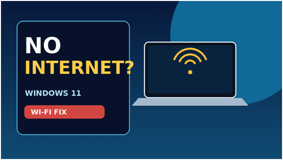 Example A – Windows troubleshooting